How to visualize the Olympic Games? Bloomberg's example for Tokyo 2020
We analyzed Bloomberg's data journalism special on the Tokyo 2020 Olympics, which features visualizations, charts, maps, and interactive medal tables.
Available in:
By Juan Pablo Garnica Munévar. Published: August 6, 2021.
Under the editorship of Alex Tribou, Bloomberg’s journalism and data visualization team produced a special that features multiple visualizations. These include results, sporting event schedules, and medals of the Olympic Games based on the International Olympic Committee and The Olympian Database data.
The page updates daily during the Tokyo 2020 competition days, and its visualizations are interactive: they allow you to explore the data by sport, country, and records over time. All the images in this review come from Tokyo Summer Olympics Medal Tracker: Medal Count by Country.
Tokyo Summer Olympics Medal Count
The Tokyo 2020 Olympics and visualizations converge in data journalism specials. Bloomberg covered the sporting event with graphics, such as area differences and golden bubbles that allude to medals as the quintessential representation of the Olympics. In addition, these visualizations feature historical data dating back to 1896.
Medals awarded vs. medals pending.
The first visualization of the special corresponds to the medals awarded and pending during each day of the Games. Then, by placing the cursor over each star representing the gold medals, a vignette appears indicating the sport, the discipline, specialty, and the winning country.
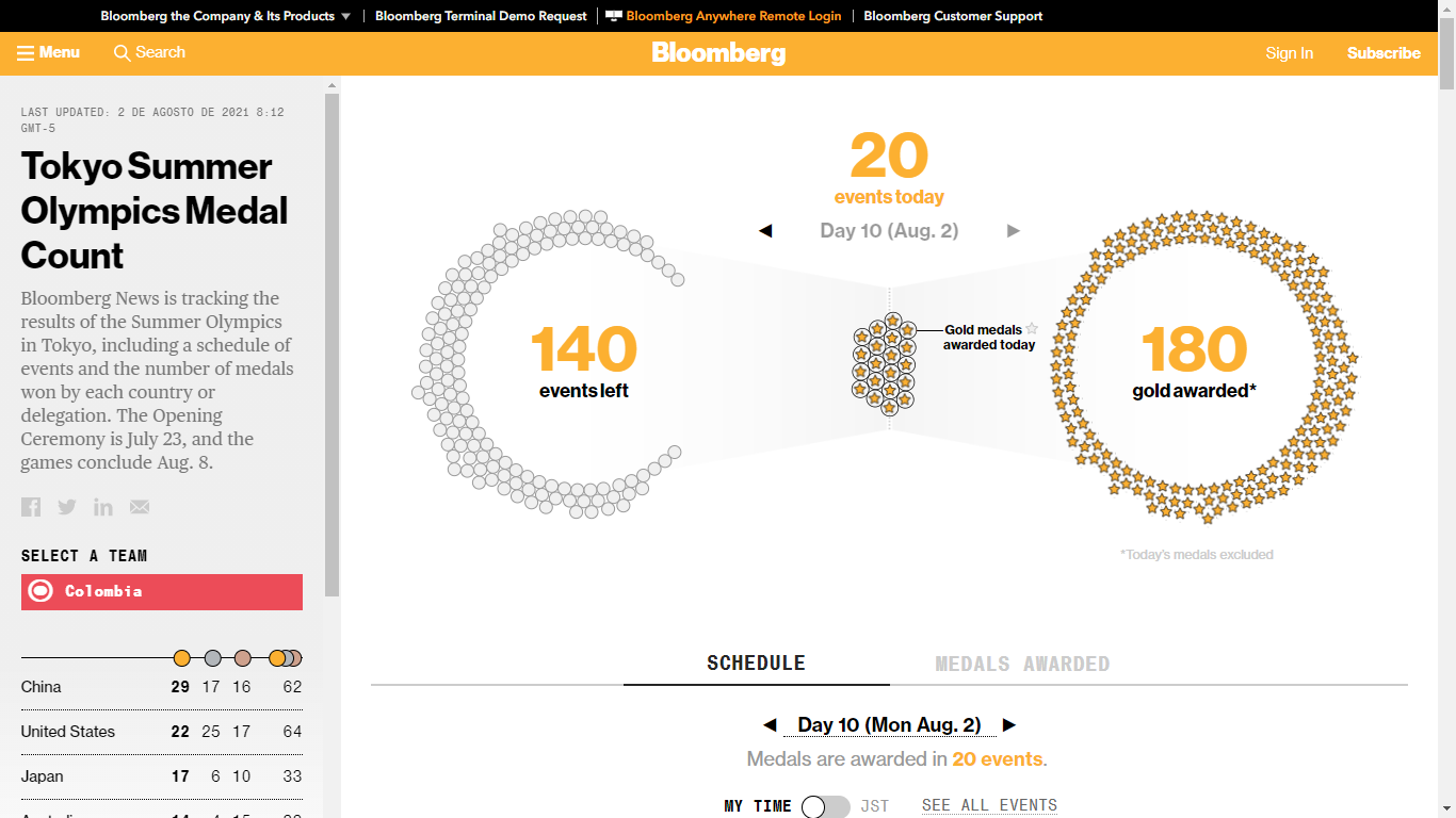
Home page of Bloomberg’s Tokyo 2020 special.
Winners of the day and medals won over time
Continuing with the navigation, there are two options: “schedule” and “medals won.” The “schedule” category shows indicators of the countries that won the competitions according to the schedule of this edition of the Games. It also shows the record of their performance in previous events. The information is accompanied by a different area chart showing the predominant country in each of these sports, along with a comparison of medals won by men and women, respectively.
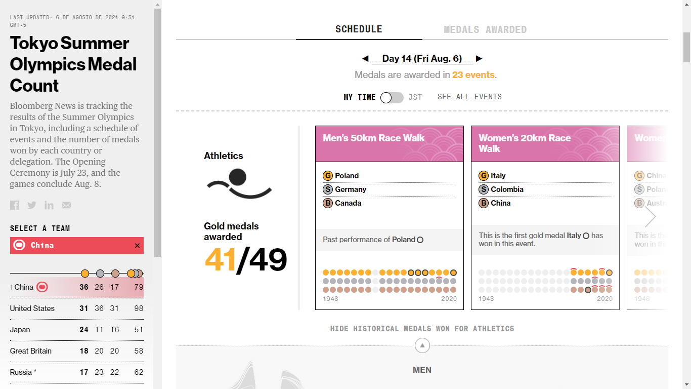
Results per sport and background of the winning country.
The “medals awarded” option allows you to filter all sports and specify the country of interest. It presents a table with the medals won in Tokyo 2020, the history of awards of the winning countries, and the difference area chart. It allows you to know, for example, the performance that Colombia has had in the editions of the Olympics, which has excelled in BMX racing, and weightlifting. Then you can compare it with the country with more medals in these categories.
In the visualizations of the oldest sports, such as athletics, the drops in the graph in certain time-lapses are worth noting. They correspond to the years when the Olympic Games were not held due to World War I and World War II. It also indicates the time at which women began to compete in each sport. In sports such as boxing, the difference is more noticeable, reaching 108 years.
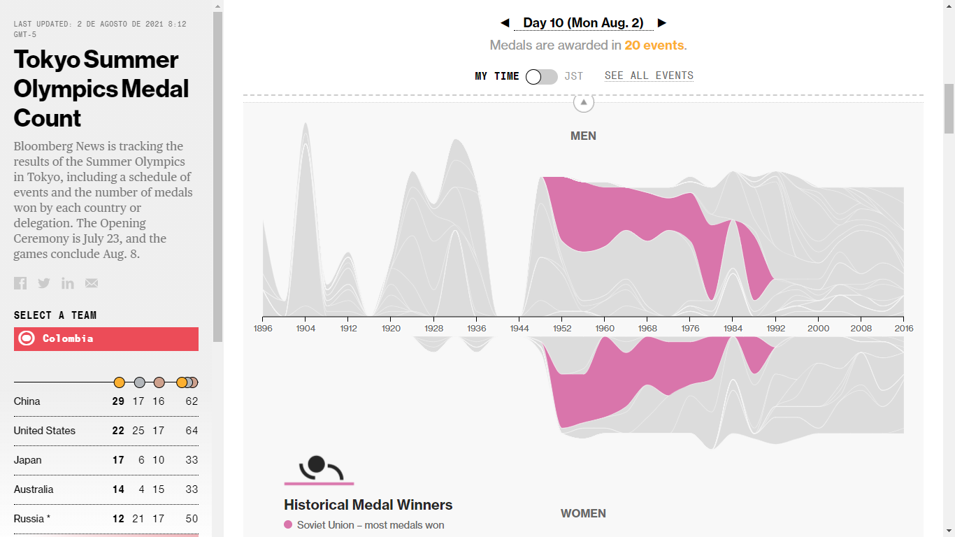
Difference area chart on medals won for athletics over time.
Tokyo 2020 medal distribution and historic
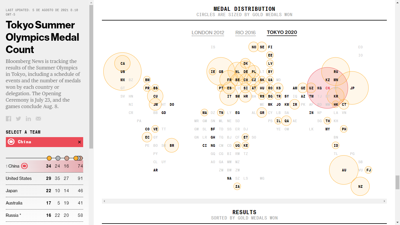
The following visualization represents the distribution of medals in Tokyo 2020 and those of Rio 2016 and London 2012, shown with a bubble map whose sizes indicate the number of gold medals won per country. In addition, it is possible to know each type of medal won. Since the page identifies the address from which you access it, the visualization highlights in red the country’s initials on the map and shows its data in the rankings of gold medals won. In any case, you can select the country of your interest.
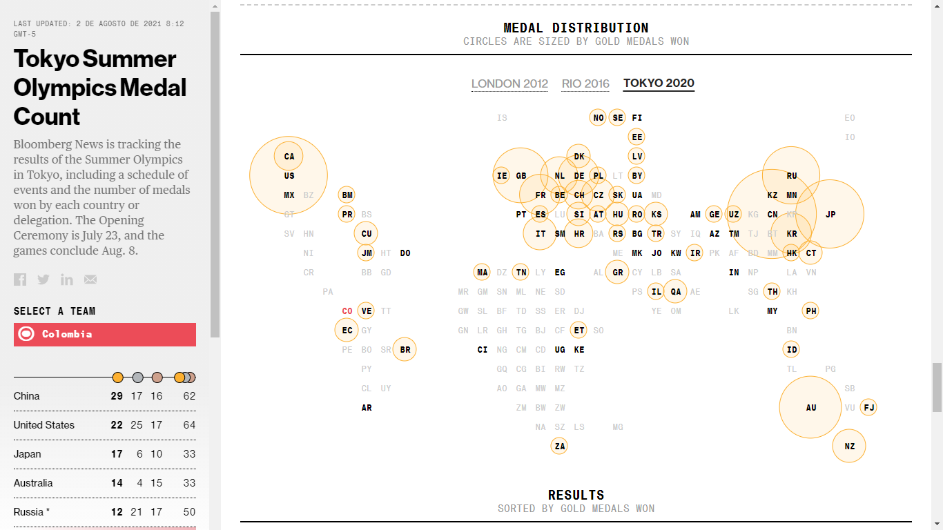
Bubble map of the distribution of gold medals won at Tokyo 2020.
Gold medal record
Finally, it presents a bubble chart with a tally of gold medals won by each country from 1896, when the modern era Olympic Games began, to Tokyo 2020, with the current ranking. You can scroll through the bubbles to see the medals won by each country.
This visualization provides compelling information, such as the countries that won medals in Athens 1896. While the United States led in gold medals, Greece won more medals among the ten participating countries. Also, thanks to it, you can learn that Colombia won its first Olympic medals (one silver and two bronze) in Munich 1972.
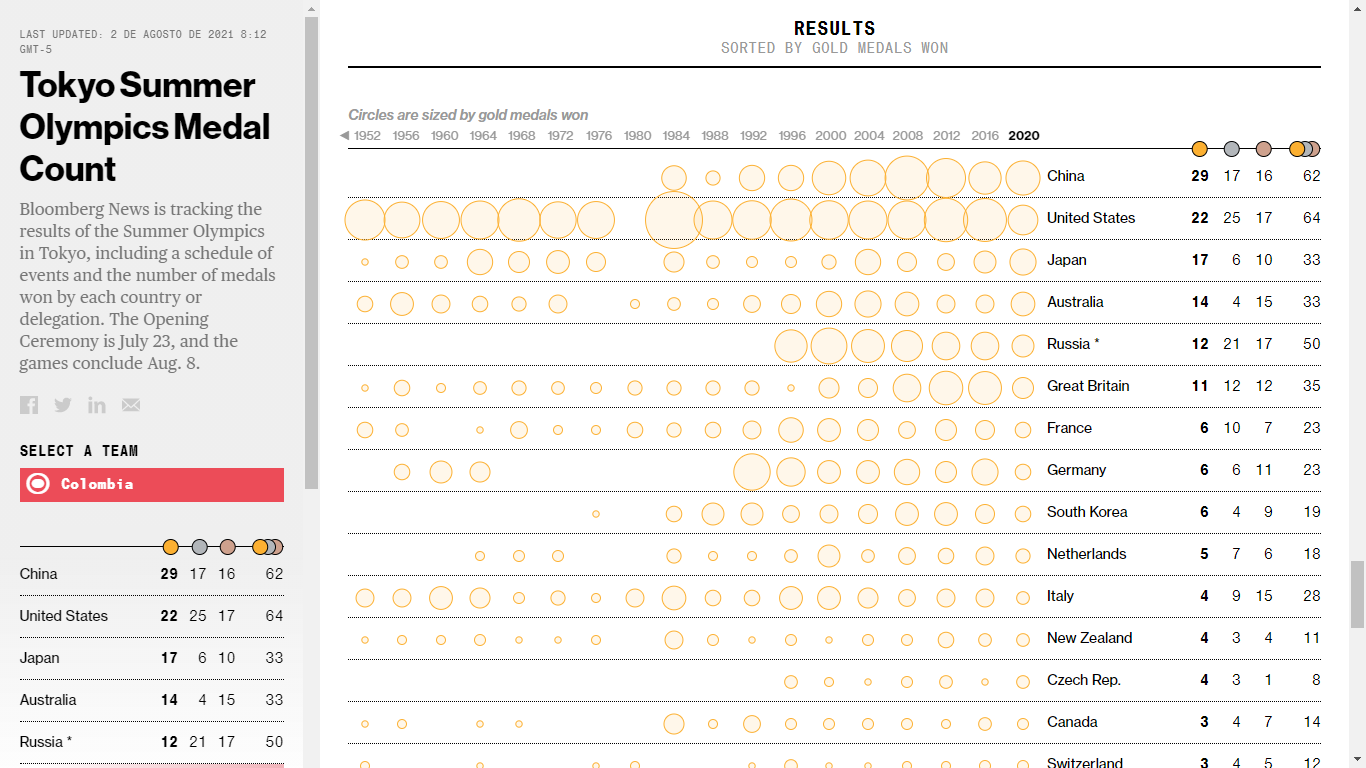
Bubble matrix of gold medals won at the Olympic Games by country over time.
If you like data visualizations and want to generate your own, we invite you to explore the tools we offer at Datasketch. Also, if you are interested in news related to data journalism, subscribe to our newsletter.


