


More charts more readers: coronavirus visual stories
How two international publications used charts, graphics and data visualization to reach a wider audience
Available in:
Published date: 2021-05-11 | By: Lizeth Moyano
In the information age and in times of pandemic, data is not in short supply. On the contrary, readers have more sources of information to choose from. For this reason, journalists and content creators are looking for ways to engage users. We have a theory: “more charts = more readers” and the article “Why outbreaks like coronavirus spread exponentially, and how to “flatten the curve” from the Washington Post can confirm it.
When charts serve a clear purpose, readers are likely to perceive the message quickly. The Washington Post had it right, so 11 days after the World Health Organization announced Covid-19 as a pandemic, they released an article that easily explains how the Coronavirus spreads. Today, it is the Washington Post’s most visited publication and is available in 13 languages.
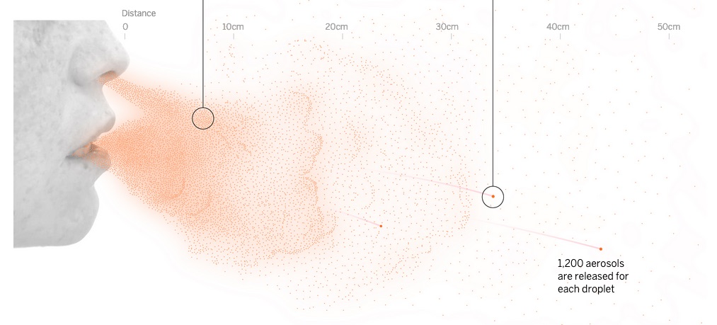
Data visualization to explain Coronavirus
They decided to explain the new event through charts. Using simulation, they visualized how the virus spreads and how it can be avoided with social distancing. The success of the publication, explains Washington Post Graphics Editor, Chiqui Esteban, “is largely because it was what everyone was looking for at the time to share with others, explained in a very effective and easy-to-see way. Sharing a visualization is easier, because you see quickly what it’s about than a long explanation in text.” Instead of frustrating users with new and meaningless words, they chose to make the information absorbable.
Currently, it is noticeable that science journalism is looking for effective ways to engage and inform audiences. But, at the end of day, attracting the attention of audiences is a constant challenge of objective journalism. Data visualization is the answer, and it is not limited to technology or sports, or politics. In contrast, it could be adapted to any topic, as long as it is used strategically. Graphics should be “a piece of work that is beautiful, engaging, simple, easy to use, easy to understand, accurate and deeply informative” says Stephen Few a data visualization author. Indeed, in some situations - such as the current pandemic - readers are actively looking for information. How much tailored to their reality, easy to analyze and digestible, it is more likely to be shareable.
In another attempt to understand how Covid-19 spreads, El País published “A classroom, a bar and a classroom: this is how the coronavirus spreads in the air”. They took situations such as the infection of more than 70 people at a party and a dozen customers in a bar to illustrate the virus transmission in closed places. They also considered some variables like time, size of the site, the number of people, use (or not) of masks, and amount of air to simulate the situations in which the Coronavirus spreads faster.
This article also had incredible reach. Users were certainly looking for information to understand a scientific reality. Indeed there were more options for the newsroom: an interview with an expert explaining or the chronicle of contagion cases. However, visualizing the scientific facts was what attracted users. So, visualizations and charts that translate unknown terms into everyday situations are a tool in the service of journalism.
Data visualizations are tools. When those are used well, it could engage users' attention and are likely to break down information more easily than a long text or a spreadsheet. They are not the shortcut to informing. On the contrary, to do so in a responsible and attractive way, the process of creating visualizations must be careful, Alberto Cairo says about it, “every good infographic is functional as a hammer, multilayered as an onion, beautiful and true as a mathematical equation.”
According to Cairo’s analogy, graphics must be useful. That is why you must be clear about why you would like to include any visualization, for each aim, there is a tool: bar chart, line chart, maps, pictograms… there are many possibilities. On the other hand, charts should not be limited to summarizing information; instead, they should allow the user to go deeper into the data as he/she analyzes and understands it. To do this, the journalist must ask about the relevance of the content, how it impacts their audience, and how it looks in their readers' context.
Finally, visualizations should not be at odds between aesthetics and effectiveness. Every data visualization must be understandable, it must be based on contrasted information, and it must be transparent regarding the source of the data. So when research, design, and usability go hand in hand, readers are less hesitant to share the content, reaching a wider audience.