


"When graphics are a matter of life and death" by Hannah Fry
We summarize Hannah Fry's article published in The New Yorker on how revolutionary graphs and data visualizations have been in problem-solving.
Available in:
By Sasha Muñoz-Vergara. Published July 19, 2021
Without a doubt, graphs are one of the most widely used tools for visualizing journalistic information, but they have also served for years to solve problems in other fields and predict particular events that have saved lives.
That is the point of an article by Hannah Fry, mathematician, best-selling author, award-winning science presenter, and host of numerous popular podcasts and TV shows.
The article takes us through a historical account of cases where graphs and their innovations have improved the way qualitative data is presented on occasions where it was not possible to see the truth or predict situations otherwise.
A graph that predicts explosions
One of these is the case of John Carter Racing, a NASCAR Sprint Cup Sprint team, which was in the most crucial auto race of the season when their car’s engine blew up. Running without knowing what was happening was as high a risk as not running. It was this graphic that allowed them to realize the problem.
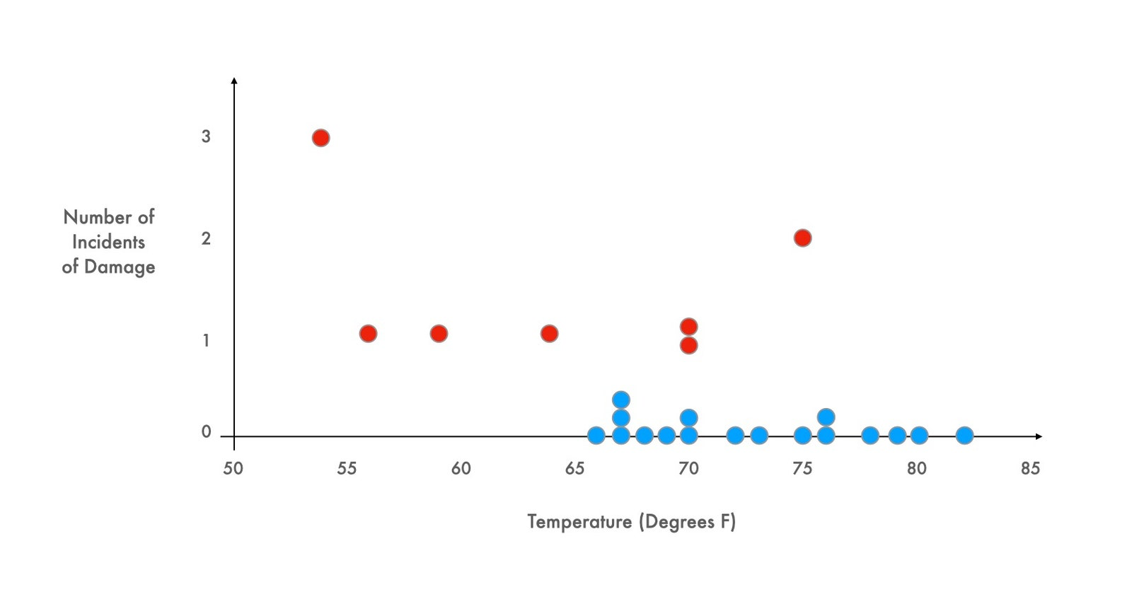
Souce: The New Yorker
They noted that all runs in which the engine behaved correctly were conducted when the temperature was above sixty-five degrees; all attempts that occurred at temperatures at or below this temperature ended in engine failure.
Scientifics knew that the shuttle Challenger would explode
Another historical case where graphs proved their relevance was with Diane Vaughn and her account of the tragedy “The Challenger Launch Decision” (1996). The article tells how some data was presented at a NASA emergency teleconference, scribbled by hand in a simple table format, and hastily faxed to Kennedy Space Center about the shuttle launch.
“The chart implicitly defined the extent of the relevance, and no one seems to have asked for additional data points, the ones they couldn’t see. That’s why the managers made the tragic decision to go ahead despite the weather.” the article states. Challenger exploded.
Watch this video on the coverage of the Challenger launch in 1986.
In “A History of Data Visualization and Graphic Communication” (Harvard), Michael Friendly and Howard Wainer, a psychologist and a statistician, argue that visual thinking, by revealing what otherwise remains invisible, has profoundly affected the way we approach problems. Graphics have left the exclusive confines of scientific research to permeate all disciplines.
van Langren shortens travel times
As data visualization became more widespread, our thinking changed. The book mentioned and cited by Hannah Fry begins with what may be the first statistical graph in history, devised by Dutch cartographer Michael Florent van Langren in the 1960s, and demonstrates how a well-made graph can save a long history of mistakes that, at the time, could have saved a lot of gas and time.
 statistical graph.")
Source: Datavis
In the 19th century, the “golden age” of data visualization, graphics found new uses in tracking disease outbreaks and understanding social problems. Friendly and Wainer argue that the explosion of graphic communication reinforced and was aided by a cognitive revolution: visual thinking. Across disciplines, people realized that information could be conveyed more effectively through visual presentations than with words or tables of numbers.
The first railroad chart
The Scottish engineer William Playfair and his book “The Commercial and Political Atlas” contributed to the area of visualization with his line chart of a time series, the bar chart, and finally the pie chart, “virtually the entire set of Excel charting options.”

1878 chart shows each train between Paris and Leon in 24 hours, by Charles Ibry. Source: The New Yorker.
In a presentation to the French Minister of Public Works in 1847, railroad engineer Charles Ibry showed a chart that could simultaneously display the location of all trains between Paris and Le Havre in a twenty-four-hour period. These train charts were not intended to be illustrations; they were not designed to persuade or provide conceptual insight. Instead, they were created as a tool to resolve the intricate complexities of timetables, almost like a slide rule.
These and other cases can be found in the article reviewed.
Don’t forget to visit our tools for creating your charts: https://www.datasketch.co/apps/.