


What is the main reason for using data visualization tools?
Why and for what purposes to use data visualization tools.
Available in:
By Edda Viviana Forero Triana. Published: August 10, 2021
Have you ever thought about how you could show data without using an excel sheet?
That is one of the main reasons why different people and organizations use data visualization tools. They allow us to have a clear idea of the information we have collected through a visual context, make the data more understandable to an external audience, and quickly identify trends and patterns.
No matter what field you belong to, a picture always says more than a thousand excel documents. That is why fast and effectiveness in communication information are strong motivations for the use of these tools.
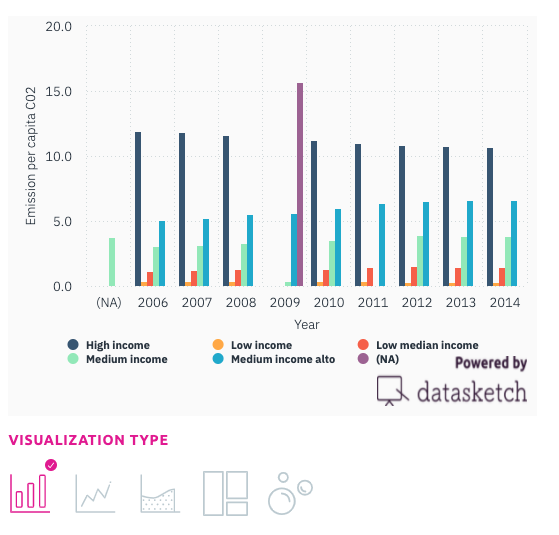
It has more impact and relevance to show this:

Source:https://www.datasketch.co/dashboard/apps/exec/vacunas-dashboard-app
Than this:

- First, because the information translates into a format that is quickly readable to the eye, we can easily relate variables to draw conclusions and make decisions.
- Second, because it is in the visualization of the data, we can identify repetitions, trends, gaps, and errors.
- Third, because it is one of the stages in consolidating information, part of its potential is wasted when information remains only in documents.
Visualization can positively influence the decision-making process. It is a crucial step in data analysis and gives us a critical view of the data. Otherwise, information may get lost among thousands of rows of spreadsheets.
Different types of data and data visualization tools
In data science, there are different types of data and ways to classify and interpret them. The “classical” method is the structuring in rows and columns. However, visualization tools allow us to design, develop and communicate graphs of data, for exploratory or expository purposes, in an agile and simple way.
The creation of a visual representation of data communicates both properties - relevance or relationships - and results. This representation does not require programming or professional technological training. Different types of tools can be found in the digital spectrum, mainly those with ease of use and availability of free software. Many of these give the possibility to insert the results in other websites such as blogs.
Depending on the purpose of the visualization, we can distinguish three types: generic, geospatial, and temporal. The first ones are for data commonly used in descriptive statistics. For example, Datasketch apps offer various graphs -bars, columns, lines, scatter, candles, treemap, bubbles, Gantt, and maps- and descriptive analysis is possible. For geospatial, we can find Make maps of the world. The maps generated with this tool can also be inserted into web pages and are used in an expository sense. There are many options to communicate information visually; with more than 200 types, it is crucial to know the advantages and disadvantages of each one, depending on the need.
The main reasons for using visualization tools are: to discard unrepresentative data. To identify variables that are dependent on others and contain redundant information. Finally, to check if what we have done in and with the data is what we expected (exploratory visualizations) and to socialize them with the target audience (expository visualizations).
If you want to learn more about data visualization tools and need to create a simple and easy visualization of your data, Datasketch offers you our free tools. You can visit it at: https://www.datasketch.co/dashboard/apps.