The Visualizations of the Tension Between Russia and Ukraine
The media have focused their attention on the tension between Russia and Ukraine. Their graphics and data journalism teams have brought out their artillery to show what is happening. What do their visualizations consist of?
Available in:
By Juan Pablo Garnica Munévar. February 17, 2022.
Russian reasons for an invasion
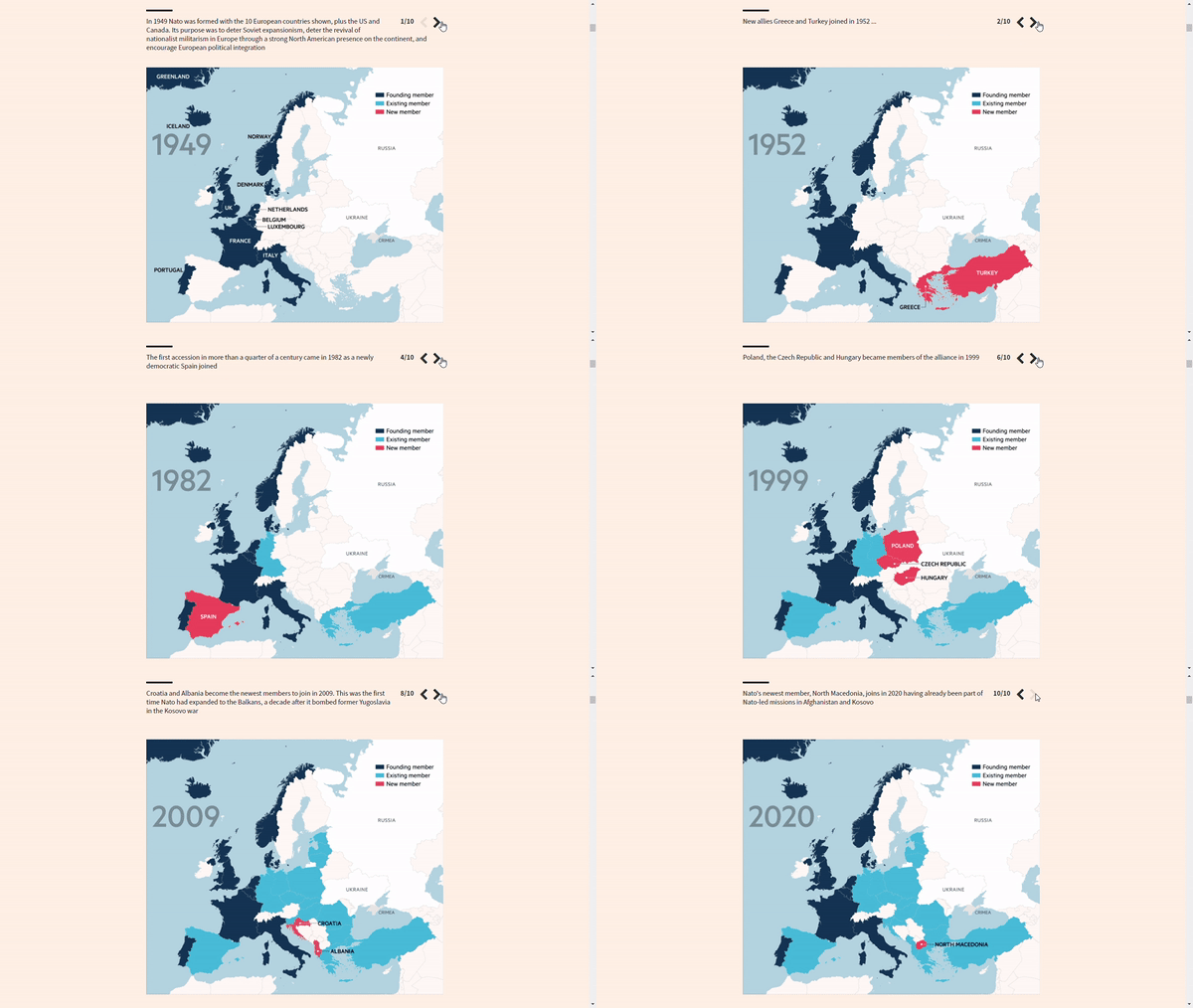
Slides of the categorical choropleth map of NATO members. Source: How serious is Vladimir Putin about launching a major Ukraine offensive?
The Financial Times Visual Storytelling Team visualized the reasons provided by Russia to justify the invasion of Ukraine. The media shows slides of the map of Europe with NATO annexations and eastward expansion. They also analyzed sections of an essay by Putin justifiying the historical union between the two nations.
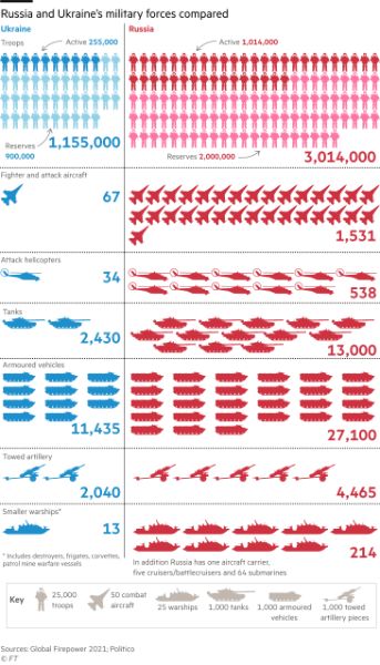
Pictorial chart comparing the Armed Forces of Russia and Ukraine. Source: How serious is Vladimir Putin about launching a major Ukraine offensive?
They used line and area charts to display Russia’s favorable economic conditions to make decisions. (Immediately, we relate this type of chart to finance). With an infographic, they represent the support of NATO and the United States to strengthen the Ukrainian Navy, which contrasts in any case with the comparative pictorial graph of the military capability of each.
Maps on the march
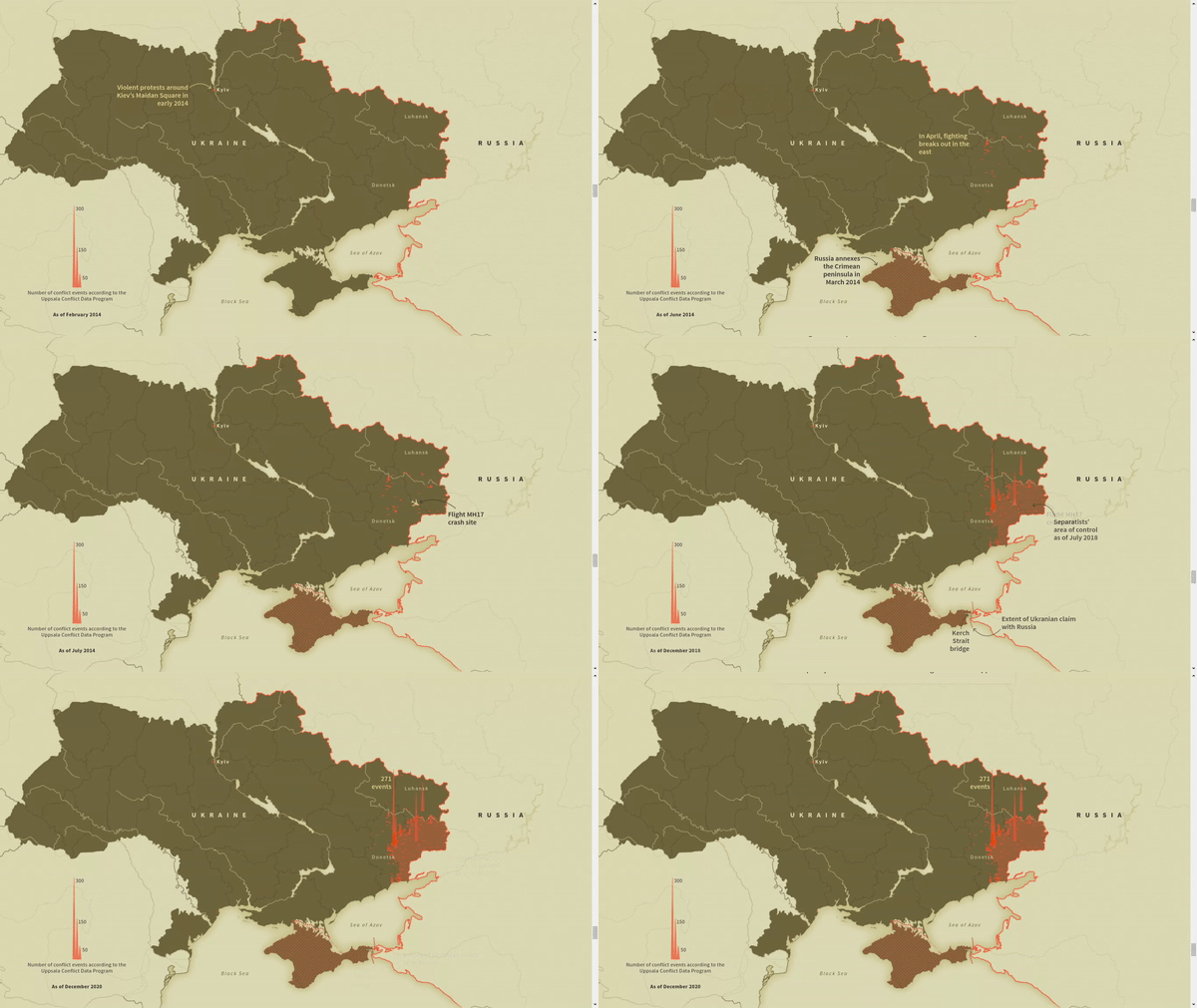
Map with bar charts of conflict events in Ukraine since 2014. Source: Mapping Ukraine and Russia on the edge of war.
Reuters Graphics prioritized maps and supplemented them with detail elements, including other graphics types. They use flow maps to depict scenarios of the Russian invasion. A bar chart map (rather spikes) demonstrates how the conflict has changed Ukraine geographically.
The choropleth map of Russian speakers in Ukraine indicates the link to its neighboring country in a specific way. More than half of the people in the Donbas region (Donetsk and Luhansk) and the Crimean Peninsula have Russian as their native language. The former is under the control of pro-Russian separatists, while Russia annexed the latter.
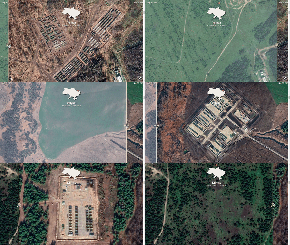
A comparative slider of images with before and after military units installed near Ukraine. Source: Mapping Ukraine and Russia on the edge of war.
Among the add-ons is the Image Comparison Slider of geo-referenced satellite images. This tool facilitates the extrapolation of two images, and with a slider, you can see the changes between them. In this case, they contrast the military units around Ukraine.
They also provided stacked bar charts and a histogram on Ukraine’s budget and military component. Despite showing the progress of this country, they do well to add the stacked bar chart showing the military capability of the two countries: Russia doubles it. With the pictures of artillery on both sides, they tried to make sure that the general (data) does not overlook the specificity (war equipment).
Troops in detail

Bubble map of troop positions around Ukraine. Source: Ukraine: How prepared is Russia for attack? - BBC News.
BBC published two reports recently. Both contain the bubble map of Russian troop positions in an updated version. This type of visualization is widespread because it pinpoints locations and indicates numbers, in this case of military personnel.
Paul Kirby’s report adds maps of areas occupied by separatists, NATO expansion, and a comparative table of each country’s artillery. From our point of view (we discuss this in more detail in another post), the Financial Times comparison may be more attractive because the pictorial chart accounts for the proportions between the units of each country. This article provides the map with the number of NATO and U.S. military in Eastern Europe, using the number of Ukraine and Russia to get the full picture.
David Brown’s article focuses on analyzing the artillery of Russian unit positions using Maxar satellite imagery. Although very specific, it makes sense of the military units we see, especially when we don’t know about weaponry.
Gas and the tempers flaring
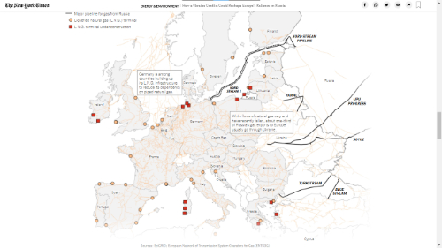
Pin map showing gas pipelines and existing and under-construction liquefied natural gas terminals. Source: How Ukraine Conflict Could Reshape Europe’s Reliance on Russian Natural Gas - The New York Times
We end with the report from The New York Times. In addition to the bubble map that Financial Times and BBC did as well, it offers a special on the economic effects of an eventual conflict. The Times presents two sets of charts. First, the Sankey diagram on the choropleth map and histograms of certain countries show dependence on Russian gas. Second, the pin map and the line graph weigh against the above given the other import options.
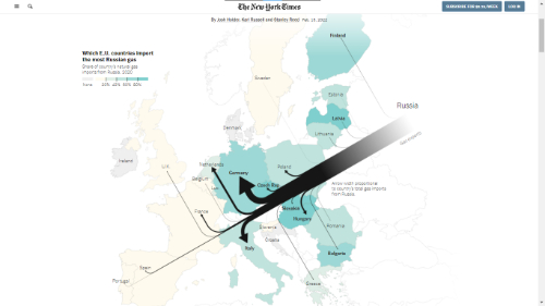
Sankey diagram of the flow of imported gas from Russia over a choropleth map on the share of imported gas in each country. Source: How Ukraine Conflict Could Reshape Europe’s Reliance on Russian Natural Gas - The New York Times
The report captivates with the Sankey diagram of Russian gas exports from the outset. It is striking that the thickness of the destination arrow (those importing the most Russian gas) is not equivalent to the proportion of gas in each country. For example, let’s look at the case of Latvia, where much less gas arrives compared to other countries but represents 80% or more of its supplies.
In conclusion, maps were indispensable to cover the tension between Russia and Ukraine. Among them, pin and bubble maps took precedence over positions. There was also the comparison between the Armed Forces and between then and now with the comparative image slider. The economy stood out as a representative variable of what is at stake. After all, a conflict entails costs and benefits: they enable or limit decisions.


