


What is an infographic?
We explain what an infographic is and how we can communicate data through this graphic tool.
Available in:
By Natalia Ruiz Hurtado. Published: August 6, 2021.
Infographics are usually described as visual representations that communicate information or data more effectively and attractively. They typically contain graphic elements such as diagrams, graphs, photographs, or illustrations, which allow us to convey information in a much more diluted and comprehensive way. Therefore, we can define infographics as educational resources by allowing us to condense data in a visual and eye-catching way.
Knowing this, we must consider a series of recommendations when thinking about visualizing our information as an infographic since saturation, whether visual or textual, can become a barrier to reaching our potential target audience interested in our data.
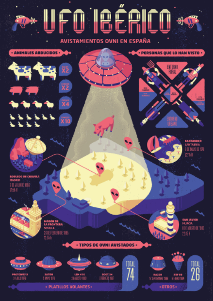
Iberian UFO. Source: https://www.behance.net/gallery/77536331/Infografia-UFO-IBERICO/modules/450212095
What should I take into account to make an infographic?
The first step is to organize the information we want to make known. It is crucial to do a prioritization exercise where we must define the most relevant data and the complementary ones. In this way, we can start thinking about which graphic elements would be appropriate to accompany our information or communicate it.
Depending on our information and its level of complexity, we will also define the type of infographics we should look for and follow as a reference. We can use the classification made by Hubspot, in which we find a total of 13 types of infographics:
- Informative infographics
- Product infographics
- Sequential infographics
- Scientific infographics
- Biographical infographics
- Geographic infographics
- Process infographics
- Chronological infographics
- Statistical infographics
- Comparative infographics
- Journalistic or investigative infographics
- Hierarchical infographics
- Unigraphics infographics
Once we have identified the type of infographics we want to create, we can start with the graphic proposal to implement. It is good to consult several references to start thinking about how it would look or what elements we could include in communicating the data. It is essential to prioritize our information at the beginning because, in this way, we can define which graphic tools are relevant and should be implemented in our infographic.
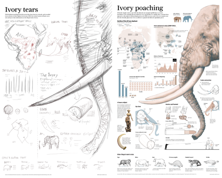
The importance of sketching. Source: https://www.behance.net/gallery/37869347/Infographics-The-importance-of-the-rough-sketch/modules/235849773
It is important to remember that the most important thing is to transmit our information clearly and concisely. Therefore, we must always balance the use of graphics, visual elements, and text.
For the graphic development of our infographics, we can use different types of design tools. Some countless pages and applications provide templates that facilitate this task. Of course, everything will depend on our expertise in the area, so it is valuable to think of a visual proposal according to our skills or resources.
Another great benefit of using infographics is paid back to companies, entities, or brands that have their data in this way. Capturing the attention of their target audience, they are transmitting your data assertively and generating what in marketing is known as “traffic,” i.e., more people are viewing the content, which is achieved thanks to the time spent by a user reading the infographic.
Infographics have become a versatile tool, offering a wide range of visual possibilities to communicate information of all kinds, managing to captivate many people by assimilating information in a much simpler and concrete way.