


Data Visualization: Line Graph
Learn how to use a line chart and when, its advantages and disadvantages and which of our apps to use to make it.
Available in:
By Edda Viviana Forero Triana. Published: August 16, 2021.
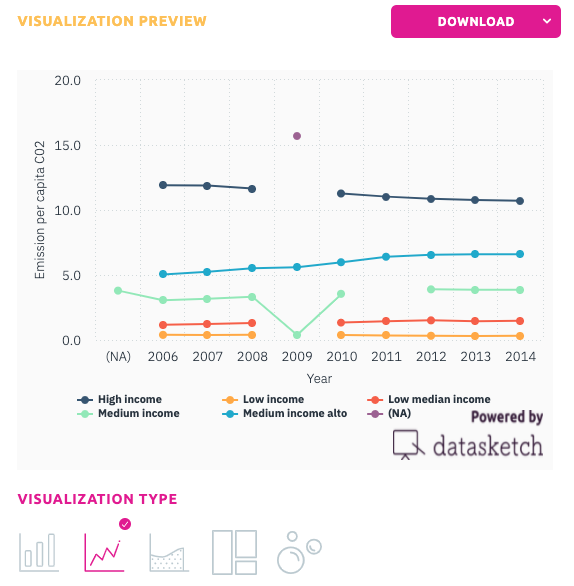
A line chart is a graphical representation of information that changes continuously over time. In the image that opens this post, we see “markers” of data points connected by straight lines that delimit the start, duration, and end of a variable on the time axis. Line charts are used in different fields for different purposes. They are instrumental when creating a graphical representation of changes in values overtime is necessary. For example, in finance, a particular company in the stock market uses this chart to see how specific company security develops over a defined time.
How to create a line chart?
Line charts consist of two axes (Cartesian grid): the x-axis (horizontal) and the y-axis (vertical), which is graphically called (x,y). The y-axis has a quantitative value, while the x-axis has a category scale. A tip is to use independent variables, such as dates, on the X-axis and dependent numeric variables on the Y-axis.
If you want to try creating your line charts, Datasketch offers two simple apps: STATIC SIMPLE CHARTS and SIMPLE CHARTS.
What types of variables can you use?
Line charts are suitable for representing quantitative data and can also be used for ordinal qualitative data. They show the change in the value of the data through their ordered values for a criterion.
A line chart is generally constructed by marking points that correspond to each data value ordered according to a criterion and then joining these by lines.
Important: the X-axis value does not need to be time, but you can use any data that behaves as a function concerning the variable on the X-axis.
What is its main purpose?
Its main purpose is to show data values changes and help in predictive data analysis (visualize trends). A graph showing quantitative values over a given time interval is more effective than bar charts in visualizing change over a defined time-space.
Limitations?
Line charts have some limitations. For example, they tend to lose clarity when there are too many data points. However, they are also easy to manipulate visually to achieve specific effects. For example, the degree of apparent change can be manipulated visually by adjusting the range of data points on the axes.


Source: https://gizmodo.com/how-to-lie-with-data-visualization-1563576606
When to use line charts?
When changes are minor, it is better to use line charts rather than bar charts. Line charts can also compare changes over the same period for more than one group.
If you want to learn more about data visualization tools and need to create a simple and easy visualization of your data, we invite you to visit our free tools. https://www.datasketch.co/dashboard/apps