


Arts and Dataviz - Data Culture #10
We review the news that brings culture and data together. March 2022.
Available in:
We share this week’s must-sees: we start with a review of our latest and following events. Then, we continue with ArtFacts.Net, the largest and most complete database of the art world. Also, we present a data visualization that links our age with characters and events. Finally, you’ll find the team’s recommendations and our Data plus at the end.
If you have been forwarded this newsletter and like it, you can subscribe here. Check out our blog and newsletters if you like data journalism, open government, and culture.
Datasketch
What we did:
March has been a month with many events within Datasketch House. First, we commemorated March 8th, giving visibility to women in data science and going out to demonstrate. Here you can read the statement from the women of Datasketch on that day.
On March 5th, we participated in the Open Data Day, with a talk on futurology and foresight (es). This event was also the opening conference to the embroidery meetings Spinning Futures 2050, an international multisite meeting between several countries in Latin America whose purpose is to understand embroidery and its different techniques as another form of knowledge to interact with data.
These meetings are held simultaneously in four Latin American cities: in Mexico City, Mexico, by the Agujas Combativas collective; in Montevideo, Uruguay, by Nuevo Reino; in San José, Costa Rica, by ILDA, and in Bogotá, Colombia, by us, Datasketch.
What's to come:
ExpoData: Women, Innovation, and Creation is a trade fair that seeks to support and make visible women entrepreneurs and generate support networks for the economic reactivation of the country.
This fair will occur at the end of April at our house. It will be part of the campaign #UnstoppableWomen of Datasketch. It seeks to make women visible in all its spheres and dimensions: social, professional, artistic, and scientific.
Follow us on social media to learn more or contact us if you want to be part of it!

Artfacts
The world’s largest online art database, ArtFacts, was founded in 2001 by Stine Albertsen and Marek Claaßen. It provides collectors, artists, gallerists, and educators with information, trends, and an analysis of the ever-changing art world landscape. Visualizations, open and recommended databases, trends, and artists' ranking gives us a holistic look at the global art sector. You can find their Limna app in the Apple Store.
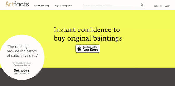
Source: ArtFacts
Visualization
Does age matter?
We measure our life in years, but what if we measure it in the number of events or what happened when we were born? If you would like to answer this question, this is your application: Who old are you?
We know that time depends on who lives it, making it relative. So, for example, if you were born in 1990, you came into the world simultaneously as the Uber company, and at your age, Shakespeare was already finishing writing Romeo and Juliet.
These are interesting facts, but what we like most about this visualization is that it allows us to see how many of the significant events happen to people who are older than you.
Society sometimes makes us believe that if we don’t achieve something while we’re young, we’ll never reach it. For example, did you know that the founder of IBM was 61 when he founded the company or that the oldest competitor in the Olympics was 72?

Source: Who Old Are You?
Recommended by the team
Here you will find events, visualizations, exhibitions, exercises, images, and gifs that intertwine data, culture, and social movements.
Culture and data
❎ The incredible rise of Wordle. Wordle is a simple game, has no advertising, only allows you to play once, and has become a viral phenomenon in many countries. With this visualization, you will know its actual impact.
🏔 Postcards from Earth’s climate futures. Would you like to see a climate-change postcard? Here you can see how iconic places transformed according to future climate conditions.
👩🏽 The long-awaited date. It is a graphic story that relives our pandemic experience and the subtle and vital difference between loneliness and solitude.
🎨 Data through design (DxD) is a New York City-based open data collective with creative engagement with data and new perspectives on understanding its role in our society.
Data Plus: The Data Vis Book Club
Source: Read “Visual Thinking for Information Design” with us! - Datawrapper Blog
Have you ever bought a book and not read it? Well, this also happens with data visualization books. That’s why Datawrapper proposes Data Book Club. The Data Vis Book Club is a virtual space to read in the community.
How does it work?
The first thing you have to do is acquire the prioritized text, either borrowed or purchased, read it. This is where the fun begins! Mention @datavisclub or hashtag #datavisclub on Twitter if you want to share your process. You don’t have to have a linear reading. You can start with the chapters that appeal to you the most. The meetings to discuss the lectures will be virtual, and the following questions will be on the table:
- 📚What is your overall impression of the book? Would you recommend it? Who would you recommend it to?
- 💡What was most inspiring, insightful, or surprising? What did you learn that you did not expect?
- 📊Once you have read the book, what will you do differently the next time you visualize data?
Keep tuned! A new book will be starting soon

Source GIPHY
See you next time!
Edda, Vero and Laura wrote this newsletter. If you have been forwarded it and like it, you can subscribe here.
Twitter | Facebook | Instagram | LinkedIn | Blog | Newsletters