


Sick Planet, TikToks, and Inclusive Crosswords - Data Culture #15
This issue's must-sees cover data visualizations on the climate crisis and emerging artists in TikTok, open databases from the LGBTIQ+ community, and the final report of the Truth Commission in Colombia.
Available in:
We are Datasketch. In this newsletter, we spread the initiatives that inspire us to keep growing as a data-driven cultural space.
We share with you this week’s must-reads: we start with the Earth’s magnetic resonance imaging. We discuss the history and facts behind TikTok’s music hits. We continue with the top 5 things we like. Plus, we unveil the Data Journalism Workshop we’ll be doing at Casa Datasketch and our data plus on the Truth Commission in Colombia.
Magnetic Resonance Imaging of the Earth
Refik Anadol, a media artist, uses the metaphor of planet earth as a sick patient that needs an MRI to visualize the symptoms of the climate crisis.
Based on data from Intergovernmental Panel on Climate Change (IPCC) reports on global warming published in October 2018, this artist created a generative adversarial network, or GAN, that makes shifting visualizations. The network shows what a magnetic resonance of the Earth would look like as a result of natural disasters related to the climate crisis if we exceed the 1.5° Celsius benchmark.
The proposal presents weather events from 1970 to the present, using a timeline with data on population, CO₂ levels, and temperatures and with more than 200 million photographs of the planet’s landscapes.
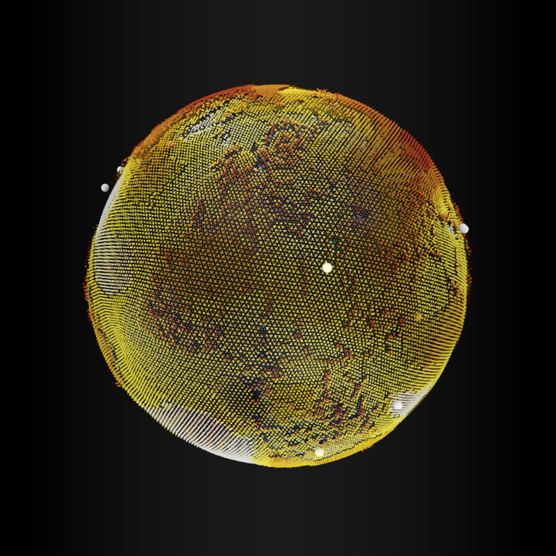
Source: Mean temperature difference 1984-2011 | NASA.
The data and the stories behind emerging artists on TikTok
What does internet fame mean for emerging music artists beyond algorithms, platforms, and industry giants? This is the central research question of The Pudding and Vox, who took the dataset of artists who went viral in 2020 and whether going viral could change the story of their careers.
In the video, you will find the methodology used for this innovative approach to how virality influences sound culture, but also the music business.
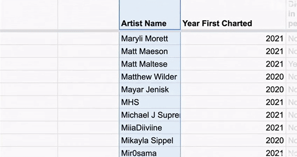
Source: Vox.
Databases for inclusive crossword puzzles
Usually, crossword puzzles are constructed from lists of names of white, heterosexual, world-famous men, except for some women and African Americans. To remedy this problem of representation in crossword puzzles, Expanded Crossword Name Database used and edited other free and public databases of names of women, non-binary people, trans people, and Afro people. It also records places, organizations, artworks, and monuments, among others, that represent groups, identities, and people that have been systematically excluded from the crossword grids.
This is a joint effort that aims to make visible the names of many people who have left a historical legacy, making their struggles and causes visible. All databases are open and reusable. You can contribute your grain of sand by sending sites, monuments, or names of people from the LGBTIQ+ community that you think to deserve to be recognized.
🏳️🌈 Discover the project
Things we like
- 😺 CatMeows: a publicly available dataset of cat vocalizations | Zenodo. Database. Dataset consisting of 440 sounds, containing meows emitted by cats exposed to various environments.
- 🎤 Why is English so hard to spell | Reuters. Display. English has many vowels and vowel types that are spelled differently, but sound the same or are spelled the same but sound different. This visualization explores the different vowels and their combinations in English.
- 🌏Point in history| Hans Hack. Map. This proposal for historical boundaries provides ready-to-use base maps for mapping historical data.
- 🪴 Where houseplants really come from | Datawrapper. Blogpost. Visualization with data we may have on hand, such as plants in a house.
- 🎨 17th-century watercolors | C82. Visualization. New project by artist and data designer Nicholas Rougeux with all mixes of watercolor paintings by Dutch artist A. Booger.
Casa Datasketch
The “Data journalism workshop for non-journalists” is a bet to demystify the city, bringing it closer through data. This is a space for learning about a form of journalism that uses technology to tell stories that represent the citizenry. It will show examples of the use of data to inhabit the city and the tools that make this possible.
This workshop is conducted by Properati - Lifull Connect, a company that buys, sells, and rents real estate in Latin America. The event completed registrations and will only be held in person.
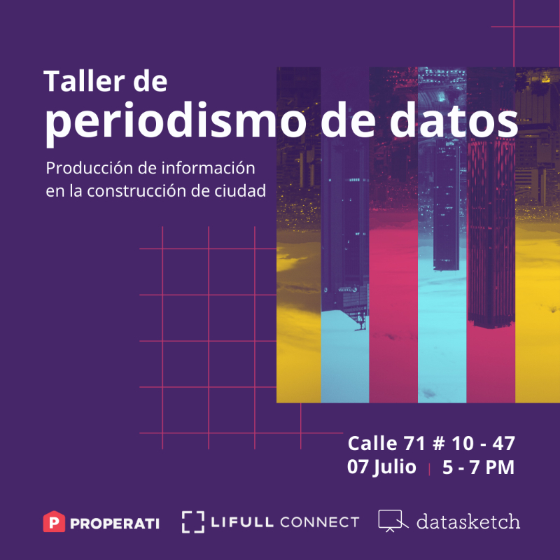
Source: Datasketch
Data plus: Truth Commission
Our team recommends the Truth Commission Final Report page. On June 28, the Commission published the report to help clarify the facts of the Colombian armed conflict and launched the “multimodal transmedia platform” for its divulgation.
The page consists of fifteen components, of which we highlight four for being interactive cultural proposals of textual, sound and visual records: the exhibitions of Exilio, the sound narrative of Volumen Testimonial, the collection of projects of Activaciones Artísticas y Culturales, and the recordings of A Viva Voz.