Maps, Feelings and Art - Data Culture #08
Do you remember the last thing you did before quarantines? Nostalgia, AI and first times- December 2021.
Available in:
We are Verónica Toro, Viviana Forero, Nicolás Barahona and Juan Pablo Marín, the Datasketch culture team.
Have you reached us through social networks, or have you been forwarded this newsletter and want to receive it in your email twice a month? Subscribe!
#FEATURED-ARTIST
Giorgia Lupi
Giorgia is a designer that focuses on humanizing data. “In her practice, she challenges the impersonality of data, designing engaging visual narratives that reconnect numbers to what they stand for: stories, people, ideas,” explained Pentagram, her design studio.
As she recounted in an interview for S Moda, from El País, Spain, Lupi has delved into design and data since she was a child, exploring possibilities for storytelling and organization. She got her start by looking at details and inventing rules for classifying objects in her grandmother’s store, an Italian seamstress.
Lupi holds a degree in architecture from the Università di Ferrara and a Ph.D. in Design from the Politecnico di Milano. Her work has been presented in London, Paris, Atlanta, Israel, Milan. She has collaborated with The New York Times, The Guardian, National Geographic, and The Washington Post, among others. Her clients include IBM, Google, Bill & Melinda Gates Foundation, and the United Nations.

Photography by Jake Chessum. Via guiorgialupi.co
Stop and Create
Which are the things we last did before the pandemic, and what have we done for the first time in this gradual return to freedom? These questions prompted Lupi to create My 2020 in Data (So Far), documenting her life during the Covid-19 pandemic.
“Reading my journal for the year, it struck me how probably all of us can recall the ‘last time’ we took the subway, sat at a bar counter, saw a dear friend. But we all likely have many ‘first times’ on our calendars as well, slowly regaining a sense of freedom and punctuating our mental timelines. I chose to tell this story in personal data,” Lupi recounted.
The result is a narrative about the value of friends, jobs, meeting places, and an inspiration to highlight the events that transform us.
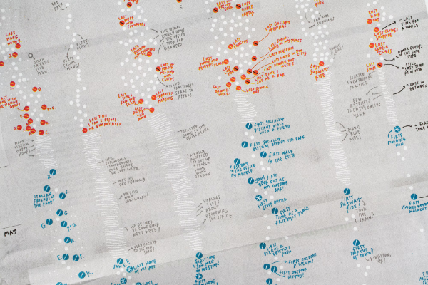
The New York Times published the visualization in the “At Home” section on Sunday, November 22, 2020. Via Pentagram
#ART-WORK
Use Well What you Have Left
A clock to be on time? This tool must have another meaning for Dries Depoorter.
Shortlife v2 is a timepiece he created to remind that, as its name says, “life is short.” The device shows how much of life has been completed based on the life expectancy in the buyer’s country. The latter is calculated using the World Health Organization (WHO) data.
To set up the watch, the user only needs to program the current time and date (other data, such as gender, date of birth, or location, are programmed in advance).

Source: driesdepoorter.be
RAND Art + Data
The RAND Corporation is a nonprofit institution that helps improve public policy and decision-making through research and analysis.
Through RAND Art + Data, a collaboration to develop new ways of visualizing their research, they invite reflection through graphic stories by a selected group of artists - Gabrielle Mérite, Morcos Key, and Giorgia Lupi. The result of the project is a new form of data expression that challenges one to think differently about the analysis of policies that affect us every day.
For example, this visualization by Gabrielle Mérite shows, from the results of a RAND study, that prescription drug prices in the United States in 2018 were 256% more expensive than in the 32 comparison countries.

#BOOKS
A Better Information Future
Lydia Pyne, a writer and historian, reminds humanity has created records by collecting observations, measurements, and information about itself and the world around it for thousands of years. Then, we started tracking agricultural performance and now we are moving into the commercialization of records of our habits.
Data, therefore, requires responsible use.
Which way must we take? Pyne recommends one: Living In Data: A Citizen’s Guide to a Better Information Future.
The author of this guide is Jer Thorp, our October featured artist of the month, who is determined that people can still be at the forefront of how our societies evolve. “To live in data is to be incessantly extracted from; to be classified and categorized, statisti-fied, sold and surveilled. Data (our data) is mined and processed for profit, power and political gain. Our clicks and likes and footsteps feed new digital methods of control.” says the description of the book.
Living in Data not only redefines what data is but also reinvents how it could be truly public and how new institutions and spaces could be created to serve people and communities.
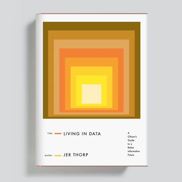
Vía Hyperallergic
The Age of AI
The authors of this book are Henry A. Kissinger, Eric Schmidt, and Daniel Huttenlocher. They seek to generate a deep conversation about how AI is changing the nature of what it means to be human.
“This revolution is unstoppable. Attempts to halt it would cede the future to that element of humanity more courageous in facing the implications of its own inventiveness. Instead, we should accept that AI is bound to become increasingly sophisticated and ubiquitous, and ask ourselves: How will its evolution affect human perception, cognition, and interaction? What will be its impact on our culture and, in the end, our history?"- they wrote in The Atlantic in 2019.
The book takes a look at the light and dark sides of AI, serving as an initial guide, raising questions about its potential impact on politics, economics, journalism, and democracies.
In November, Kevin Roose, a technology columnist for The New York Times, conducted a most striking exercise on the book. He decided to review, relying on Sudowrite, a writing program that uses AI by supercomputers containing some 285,000 processors.
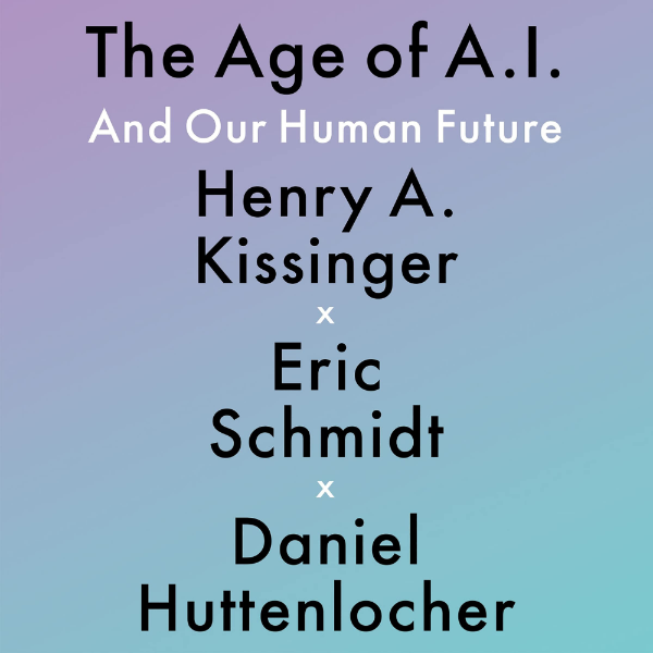
Source: A Robot Wrote This Book Review - The New York Times
#VIDEOGAMES
A Colombian Approach
These video games were made by Industrial Design students from the Video Game Research Seminar of the Pontificia Universidad Javeriana, Bogota, Colombia. In this space, the students developed different cultural themes of the country and addressed social problems.
Among the projects were Pa la Feria, which refers to the Flower Fair in Medellín, and REM: Inherited Myth, highlighting the myths and legends of a country that has gradually forgotten its roots.
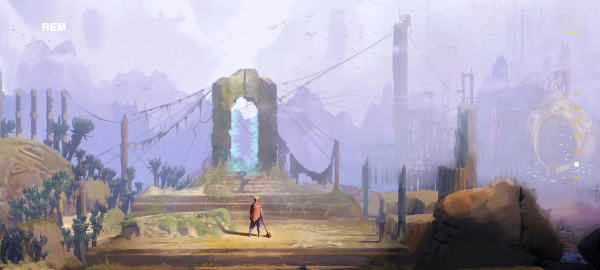
Source: REM
#MAPS
The #30DayMapChallenge left us impressed by the creativity and variety of the designs. We talked about this challenge in issue 7 of our Data Journalism newsletter, with a selection of some of what we consider to be the best entries.
It is a space with infinite possibilities. We offer you here a new selection of publications that, through great artwork, highlight the environment and pop culture and can serve as inspiration.
🌋 The eruption in La Palma, Spain.
🗺️ A map of the world made with official Unicode emojis.
💧 A mapsweeper (like Minesweeper).
🦅 The flight patterns of the Himalayan vulture.
📏 The length of the English Wikipedia article for each country.
In addition, we highlight two other maps which, although they did not participate in the challenge, caught our attention:
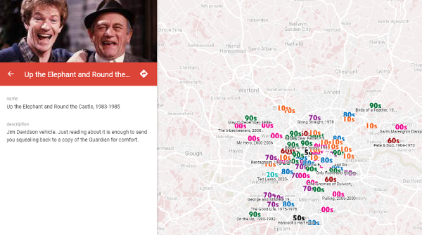
Source: The Londonist
#CULTURAL-INDUSTRY
Algorithms and Nostalgia
Grafton Tanner, a writer focused on Big Tech and neoliberalism, reflects how production, content sales, and user growth are being driven by artificial intelligence and data collection.
According to Tanner’s analysis, nostalgia has become a selling point to nurture recommendation models for songs, movies, video games, and products. It is a retrospective algorithm that determines the future.
“No streaming platform can accurately predict taste; humans are too dynamic to be predicted consistently. Instead, Spotify builds models of users and makes predictions by recommending music that matches the models. […] Eventually, listeners may start to resemble the models streaming platforms have created. Over time, some may grow intolerant of anything other than an echo.”
Read his essay published in Real Life, a magazine that chronicles what it’s like to live in a technological world.
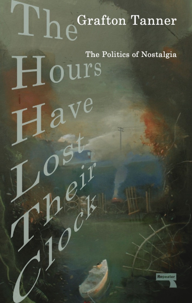
The Hours Have Lost Their Clock, book by Grafton Tanner. Via Penguin Random House
#AI
The Impacts of Technology
Anatomy of an AI System is a multimedia explanation of the various components and factors behind the production of artificial intelligence.
The project consists of a map and a 20-part essay demonstrating how AI extraction and production systems operate while showing their social, environmental, economic, and political costs.
The case study is Amazon Echo, a voice-controlled personal assistant whose production and operation integrates technology, data modeling, capital distribution, and, of course, nature.
The authors of this research, winner of the Digital category of the 2019 Beazley Designs of the Year award, are Kate Crawford and Vladan Joler. Crawford has been a research faculty member at New York University and is a senior researcher at Microsoft Research. Joler, meanwhile, is a professor at the Academy of Arts at the University of Novi Sad and founder of SHARE Foundation.
You can view the complete design (PDF format) at this link.
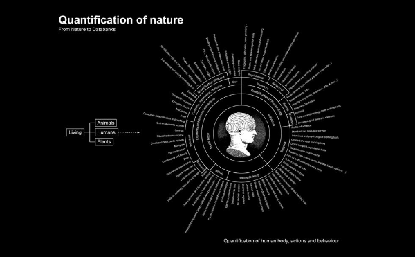
Source: Anatomy of an AI System
AI Artwork
This application allows you to create designs using artificial intelligence. It offers a wide variety of art styles, which can be: mystical, festive, dark fantasy, psychic, pastel, HD, vibrant, fantasy art, steampunk, ukiyo-e, and synthwave.
It’s called Wombo. You can use it from the web or on your mobile device. Also, if you want to know other users’ designs, you can explore the app’s profile on Twitter.
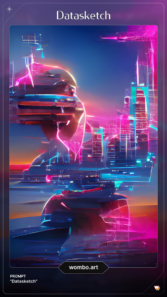
A Datasketch design created at Wombo.
#EDUCATION
Data Can Help Art
The Arts Education Data Project puts forth a data-driven, systemic approach to understanding the current state of arts education in the United States. It seeks to increase student engagement in education and highlight the importance of art education based on factual evidence.
“Before we undertook this project, no one really knew the true status and condition of arts education in the more than 100,000 schools serving more than 50 million students nationwide,” they said on their website. The project has been running for more than 15 years. Nowadays, it is present in 31 states and seeks to expand to all US country areas. To this end, they have been answering key questions such as:
- Which schools provide access to arts education and disciplines (dance, music, theater, visual arts, multimedia arts)?
- How many students are participating?
- How many art teachers are providing instruction?
- Who has access to arts instruction?
- How have the answers changed over time?
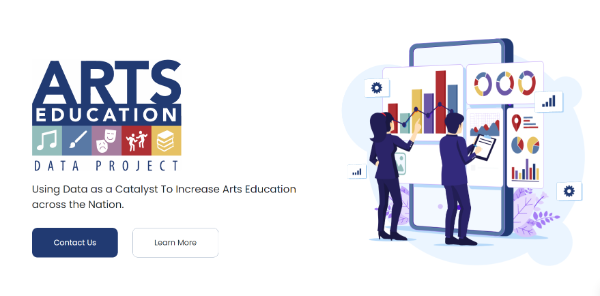
Source: Arts Education Data Project
That's all for now!
We invite you to stay tuned to our newsletter. Together we strengthen the data culture!
If someone sent you this email and you want to keep updated with the best data culture, we invite you to subscribe.
Remember that in Datasketch, we have other newsletters, with which you will also learn about Data Journalism and Open Government.


