


Wealth, Limited Rights and Education - Data Journalism #12
We cover researchs on wealth gas emissions, abortion restrictions and student achievement assessments. April 2022.
Available in:
This edition covers diverse topics: research on wealth gas emissions and abortion restrictions, student achievement assessments, and even the partial results of the #30DayChartChallenge. As usual, We share our selection of featured content and a dash of humor.
Newsletters | Blog | Subscribe
A Limited Right
Abortion is a constitutional right in the United States. Even so, this right has multiple limitations due to the political and federal configuration of the country. This makes it, in many places, time-consuming, exhausting, and costly.
Undue Burden is FiveThirtyEight’s special covering the restrictions on the procedure in each state. It presents the story of a woman living the entire process in graphic story form, accompanied by text, quotes, and visualizations of real data. Like other women and pregnant people, she faces prohibitions, delays, and social stigmas.

Source: Illustrations by Nicole Rifkin in Undue Burden | FiveThirtyEight
PISA Results
Nathan Yau made a beeswarm plot of the results of the PISA test, the Program for International Student Assessment. This type of chart highlights individual points in a distribution. Thus, one point represents the result of a certain country in three columns per subject (reading, mathematics, and science).
This chart helps to identify the difference in performance in the areas, and it seems that the trend is that students from the same country score uniformly across them.
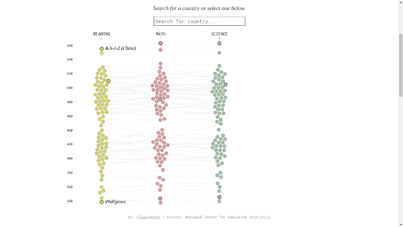
Source: Literacy Scores by Country, in Reading, Math, and Science | FlowingData
The More Wealth, the More Greenhouse Gas Emissions
The questioning of greenhouse gas emissions from Jeff Bezos' flight into space highlighted the responsibility of the wealthiest people in the climate crisis.
Bloomberg delved into the individual carbon output of wealth from World Inequality Lab data. “The trend is clear: emissions generally rise with wealth”, the report says, which exposes the shift in focus to particular individuals rather than nations and possible climate action.
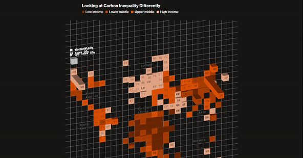
Source: How the World’s Richest People Are Driving Global Warming | Bloomberg
30 Day Chart Challenge
The #30DayChartChallenge is underway. In the first two weeks of April, two of the five categories that make up the challenge have taken place: comparisons and distributions. As promised in issue 11 of this newsletter, here are our three highlights of the challenge.
Day 1. Comparisons and Part of the Whole
Thom-Ivar van Dijk’s donut is a simple, eye-catching graphic that serves its purpose. Plus point: the image includes the data source, essential when visualizing. Something to improve: we would like to know the percentages of the rest of the flavors.
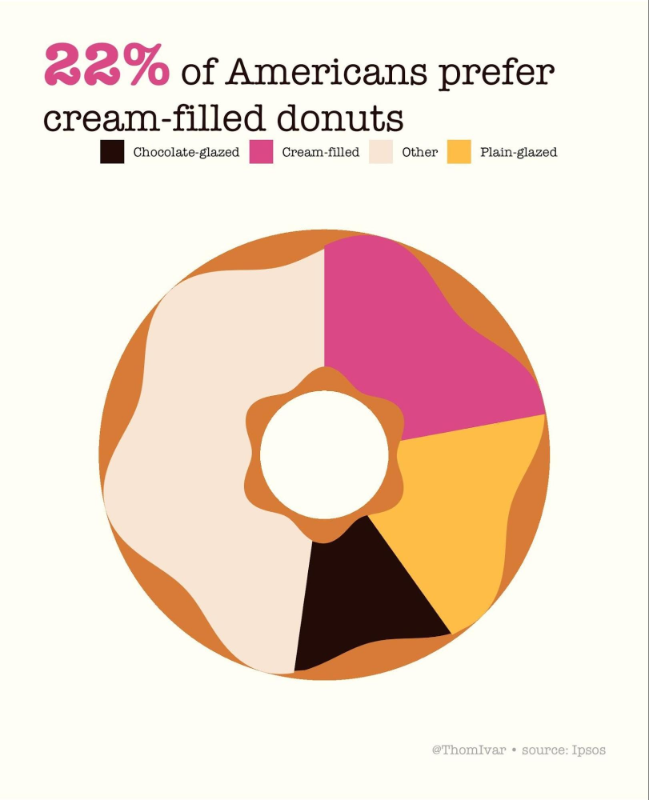
Source: Thom-Ivar van Dijk | Twitter
Day 6. Comparisons. Data Day. Our Word In Data
We find Pablo Alvarez’s chart on life expectancy by sex interesting. In addition to comparing the differences between the country highlighted, Lithuania, it allows us to see how this indicator is situated in other countries. Again, he includes its data source, and not only that: in his post, he acknowledges and cites data visualizer Eleonora Nazander as his inspiration.
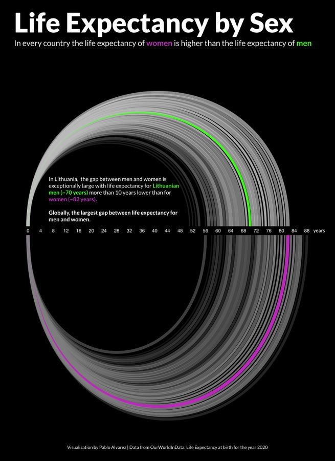
Source: Pablo Alvarez | Twitter
Day 10. Distribution. Experimental
We like it for its subject. In addition, it mixes qualitative data, from text analysis, with data visualization. It allows understanding the book and its characters at a glance.
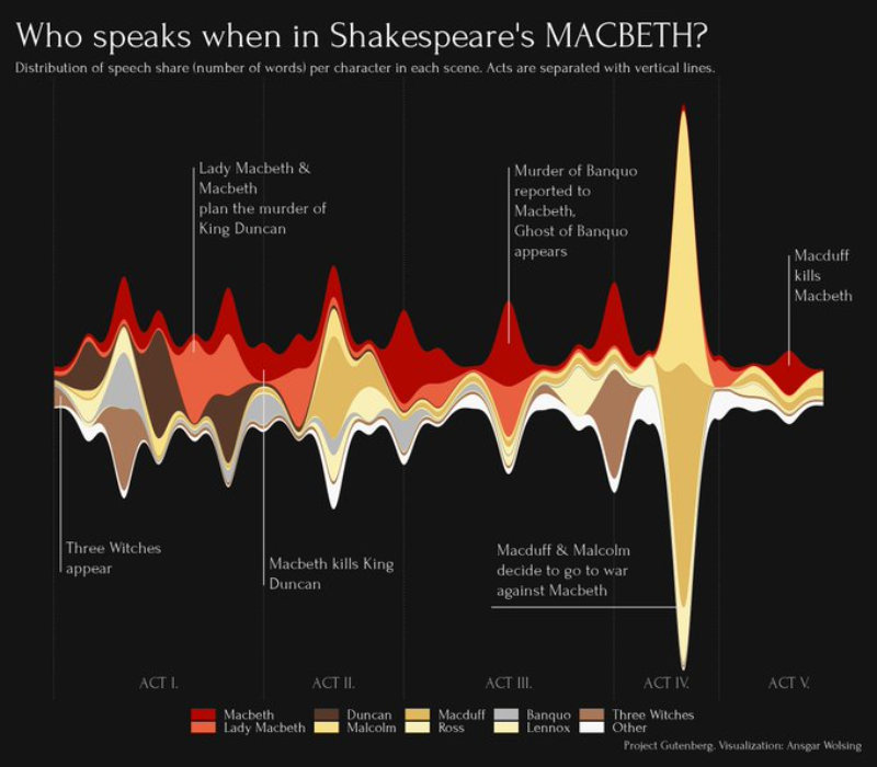
Source: Ansgar Wolsing | Twitter
Save the Date
Inspiratorio is conducting Conversaciones en movimiento: diálogos para un piso común (Conversations in Motion: Dialogues for a Common Floor). They consist of a series of webinars dealing with inclusive communications. They run from March 29 to May 10. There are still six conversations in the pipeline, whose topics are feminisms, children, indigenous communities, LGBTIQ+, migrants' human rights, and climate action.
Want to Read More?
We provide you with a varied selection of content that we like.
Culture
- 🕴️ The 50th anniversary of “The Godfather” | Reuters Graphics.
- ⌛🧍 How Many Humans Have Ever Lived? | Visual Capitalist.
Maps
- 📍🇺🇦 How cartographers track and map Russia’s war in Ukraine | The Economist.
- 🗾 A mapping toolbox for journalists: 10+ tools worth checking out | Alastair Otter - Media Hack
Economy
- 🎈 Inflation Continued to Worsen in March, as Gas and Rent Costs Rose | The New York Times
A Dash of Humor
In challenges like the #30DayChartChallenge, there is also room for visualized humor. We know that feel, bro (pal), but where is the source of this data?!
Source: Visual Scribbler | Twitter
We Must Do Something
As many of you know, Datasketch is headquartered in Colombia. The government is limiting the right to petition because of the pandemic, and we are concerned. In doing so, it also limits the freedom of speech and the freedom of the press. We call for the re-establishment of deadlines for public institutions to respond to this right. We know that this problem also exists in other countries, so we ask for support and not to lose rights already won. #AccesoALaInformacionYa

See you Next Time!
Subscribe to our newsletter! You will receive our content directly in your inbox.
Juan Garnica and Laura T. Ortiz wrote this newsletter. Learn about data journalism, open government, and data culture in our blog and newsletters.