


Sexual Rights, Data Protection and Sport - Data Journalism #02
The latest trends in data journalism, relevant and updated information that we believe can be useful for your journalistic work.
Available in:
If you have been reached through social networks or forwarded this newsletter and would like to receive it in your email twice a month, subscribe!
Puedes leer la versión en español aquí.
This newsletter is compiled and edited by Datasketch’s Data Journalism team, composed by Nicolás Barahona, Juan Garnica, Laura Tamia Ortiz, Sasha Muñoz-Vergara, and Juan Pablo Marín. In it, you will find the latest trends in data journalism, relevant and updated information that we believe can be useful for your journalistic work. Also, if you want to read the previous newsletters, you will find them at Datasketch Newsletter - Data Journalism.
#DATASKETCH
In our blog, we have started to publish articles related to journalism and data visualization. In them, we review the work of other authors, analyze information, and recommend tools.
Protecting your Data by Protecting your Passwords
Protecting the data you use for your research and your personal and work files is essential, especially if you are a journalist and your career depends on the information you guard. However, we are not always aware of the importance of using secure passwords daily. This article will help you become mindful of the importance of managing your passwords correctly and provide you with tools for this task. Protect your data by protecting your passwords.
Do Journalists "Hide Behind" Sources When they Use Numbers in the News?
Do you think it’s better to be the first to publish a story or do it the best way, even if you don’t have the exclusive? Times to produce content in the media are frantic, and quality is demanded that can only be achieved with deep research. Some media decide to get more clicks on their pages by broadcasting a story first and rectifying it later.
This decision can generate problems since they use numerical information that can end up spreading false news and causing misinformation if not treated with care. To avoid such situations, we review “Do journalists ‘hide behind’ sources when they use numbers in the news?” an article by NiemanLab. In addition, you will find reflections, advice, and analysis on the urgency of exercising journalistic work professionally in the post.
Bring Data to Life
Sometimes audiences don’t like numbers. That’s why it’s vital to find stories in data and numbers, looking for what they mean and giving a context that helps understand what they mean accurately. With this in mind, we have compiled tips to give dynamism to your news. Figures, visualizations, or tables sometimes appear complex, difficult to communicate. That should not be a problem, but a way to challenge us to make clear, simple, and precise messages that we give to our audience. Remember that in Datasketch, we have free tools for your data visualization. Read the full article at Bring data to life.

#EVENTS
Abraji opens registration for the 16th International Congress of Investigative Journalism.
The Brazilian Association of Investigative Journalism (Abraji) has opened registration for one of the most significant journalism events in Latin America.
The 16th International Congress of Investigative Journalism will be held for seven days, from Monday, August 23 to Sunday, August 29, 2021. It will feature more than 150 guest speakers, including 17 people from Africa, the Americas, Asia, and Europe. You can register at the following link.
The Abraji Congress has been held since 2005. Last year it reached a record of 10,000 registrants. It will have two satellite events. One is the VIII Research Seminar, where academic research on journalism will be discussed. The other is the III Data Sunday, a marathon of data journalism courses. Participants must register for the two events separately.

#TRAINING
University of Texas Journalism Courses
The journalism course program at the Knight Center at the University of Texas at Austin offers two types of training: Instructor-led courses, which are available for a specified period (usually four to six weeks), and self-directed courses. Self-directed courses are open to anyone, and self-paced, ongoing learning materials are available here whenever you want to learn new skills for your work.
Product Strategies for Journalism
This course is conducted by the Knight Center for Journalism in the Americas, in partnership with the News Product Alliance and the Google News Initiative. It will explain how to align content, audiences, business, and technology.
It has four weekly modules, which will be developed between August 23 and September 19, 2021. Its objective is to help communication professionals develop a product mentality in their routines. Paty Gomes will be the instructor in Portuguese, Mariano Blejman will lead the Spanish version, and Adriana Lacy will be in charge of teaching the course in English. We invite you to also learn about journalism, visualization, and data analysis by visiting our blog.

#VIDEOS
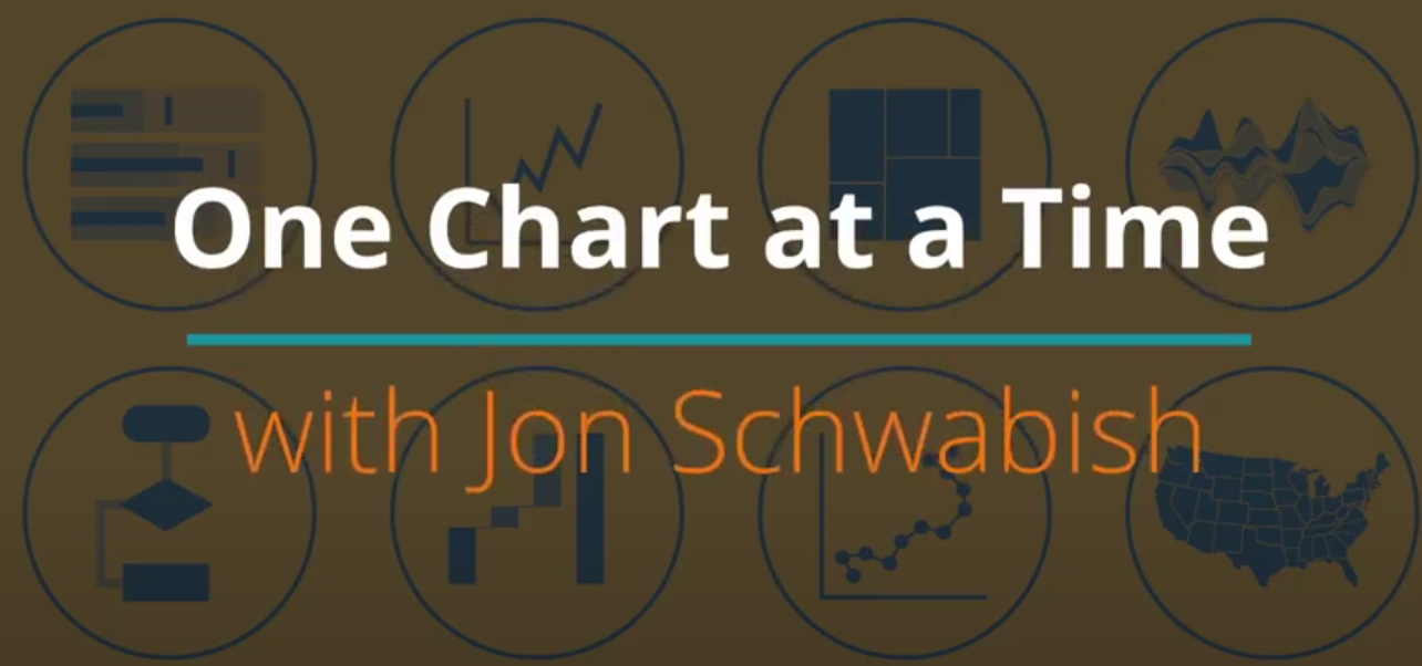
Experts teach you about Data Visualization
Learn about more than 50 types of charts from experts from around the world working in the field of data visualization and journalism in the One Chart at a Time series, a YouTube initiative created by Jon Schwabish, an economist. He specializes in the development of visualization. The videos, whose publications began in January of this year, are presented by different researchers, professionals, freelancers, governments, and the media. There are 56 episodes that you can watch here.
#NEWS
A Twitter algorithm selects the most popular stories on data journalism.
Peter Georgiev and Connected Action’s Top 10 data journalism stories for Global Investigative Journalism Network (GIJN) discuss weather disasters, Olympic coverage, Russian medical service, and Bulgarian coal plants. The stories were tracked between July 26 and August 1.
Their mapping found investigations into climate catastrophe in Germany, air pollution in South Asia, and deforestation in Brazil. They also feature some of the best data-driven coverage of the Tokyo Olympics by The New York Times and The Washington Post, an investigation into Bulgarian coal plants by the Organized Crime and Corruption Reporting Project (OCCRP), and a guide to creating engaging data visualizations based on simple graphics.

Twitter wants to provide a more reliable context to its content.
Twitter announced a partnership agreement with @AP and @Reuters agencies to improve the credibility of information on its platform. It is an effort to add a reliable context to massive conversations and facts of great interest. With those journalistic organizations, it seeks to scale, in a more agile way, quality, and specialized content, avoiding manipulation or misleading people who do not know the news agenda.
The collaboration agreement will enhance the Twitter curation team’s ability to ensure credible information is available in real-time as critical conversations unfold. To learn more, click here.
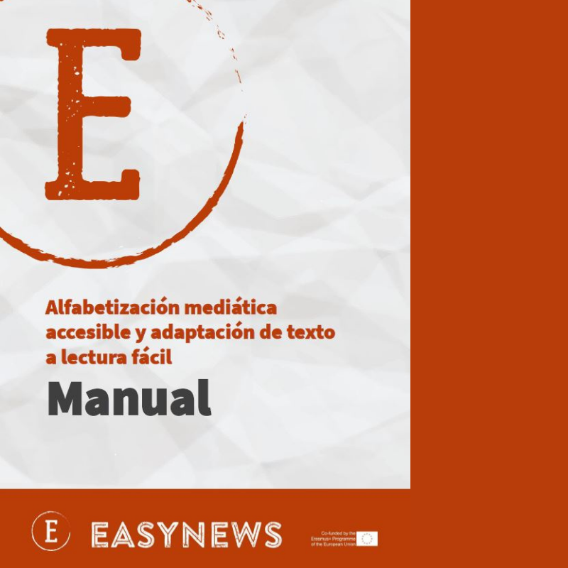
Easy Reading Guide
The Instituto Tecnológico del Producto Infantil y Ocio (AIJU) and other international organizations are developing a project to address the information difficulties faced by people with intellectual disabilities.
The project is called Easynews and is co-funded by the European Commission through the Erasmus+ program. It is developed with collaborative work between different countries and associations. Its objective is to create an application that transcribes texts to easy reading and encourages interest in journalism. Its final result is the creation of a training manual on media literacy for people with intellectual disabilities.
The manual has two sections. First deals with media illiteracy and how to use technology to solve it. The second seeks to promote easy reading, teaching how to use a short sentence structure, simple and commonly used language supported by descriptive images. That is expected to enable the media to reach more people, regardless of their reading and writing skills. If you want to know more about the Easynews project and download the guide, you can access this link (es).
#INVESTIGATION
Olympic Games sport managers
@_ojoconmipisto Guatemalan media and Datasketch ally investigated how the nearly 64 million dollars allocated by the Constitution to federated sport is being used. Until then, the local press had not audited this public money, allowing institutions such as the Guatemalan Olympic Committee (COG) and the Autonomous Sports Confederation of Guatemala (CDAG) to manage 50% of these resources with free autonomy. They found that the directors and administrative personnel sell services to the State, even though the law prohibits this. They also note the increase in the per diems of the board of directors members, despite the reduction of trips abroad for Covid-19 and others that you will find in the special.
Access the complete investigation in this link (es) and support transparency journalism.

#VISUALIZATIONS
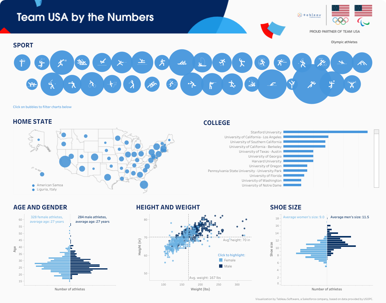
Best visualizations of the Olympic Games.
It’s possible to tell unique stories with sports data. An excellent example is Bloomberg’s data journalism special on the Tokyo 2020 Olympics. The visualizations, graphics, and interactive medal charts are not to be missed, and we included some fun facts about Colombia’s participation and the Games in general! Learn more about this in our blog.
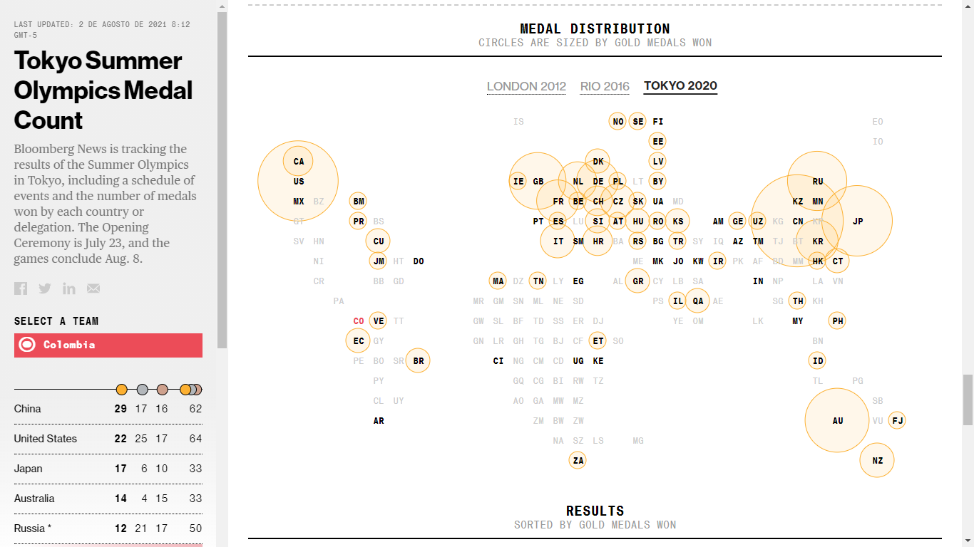
We found so many ways to show the data that we decided to post about the best visualizations of this edition of the Olympics. They cover different topics creatively: one of them used augmented reality to experience sport climbing! You will indeed be surprised by the scope of the visualizations.
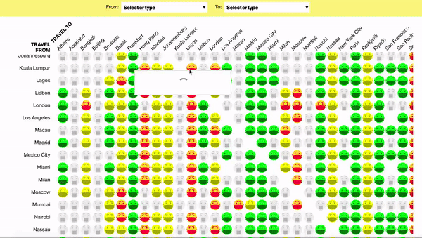
Covid-19
Planning to travel overseas but don’t know where to start? Bloomberg’s Travel Reopener Tracker will help you make a good decision.
They are tracking 1538 travel combinations among the 40 most visited destinations for business and tourism globally. They take into account coronavirus travel restrictions, vaccination levels. And public health rules.
#COMMUNITY
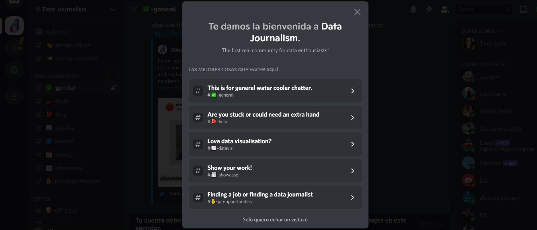
DataJournalism creates a data journalism community.
Datajournalism.com created a community with more than 700 members enthusiastic about data journalism, live events, and other content on the Discord platform.
They have eight channels to talk about general topics, tools, data visualization, programming (mainly in R and Python), events, featured posts, and job opportunities. One of the community managers is Tara Kelly, a data editor at Datajournalism and a European Journalism Center (EJC) member.
There is no cost to join, and it’s an excellent opportunity to stay informed about the best data journalism projects and initiatives around the world. You can enter here.
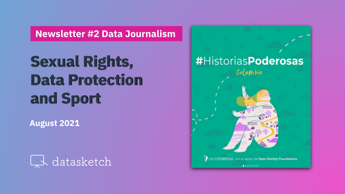
Stories on access to sexual and reproductive rights in Colombia
Chicas Poderosas is a global community that seeks to inspire and develop the role of women in the media. In their first Powerful Stories Lab in Colombia, they published five multimedia stories (es) in July about how women and LGBTTQI+ people live their sexual and reproductive rights in remote country areas.
They produced five stories published in five different media outlets. They talk about the difficulties faced by women in rural areas in learning about and accessing contraceptive methods (es); about the experiences of transgender people seeking abortions (es); about the neglected but essential profession of midwifery (es); about women organizing to learn about and claim their rights (es); and about the situation of sexual exploitation faced by Venezuelan migrant women (es).
On August 12, they opened the call for the Powerful Stories Lab in Brazil, focused on narrating how the pandemic crisis-affected women in that country.

That's all for now!
We hope our selection of news has been of interest to you. If someone sent you this email because they think you might be interested and want to receive this newsletter twice a month, you can do it here!
We have other newsletters: