


TV Shows, Castles, and Dinosaurs - Data Journalism #05
Summary of October's highlights in Data Journalism, visualizations, climate change, corruption and many more topics.
Available in:
Hi! We are Nicolás Barahona, Juan Garnica, Laura Tamia Ortiz y Juan Pablo Marín, Datasketch’s Data Journalism team.
Have you reached us through social networks, or have you been forwarded this newsletter and want to receive it in your inbox twice a month? Subscribe here. If you want to read our previous issues, you can do it here.
#DATAVIZ
These weeks have been full of good reports that use data as a source of information. We highlight three that have caught our attention because they reach the readers friendly and understandable way.
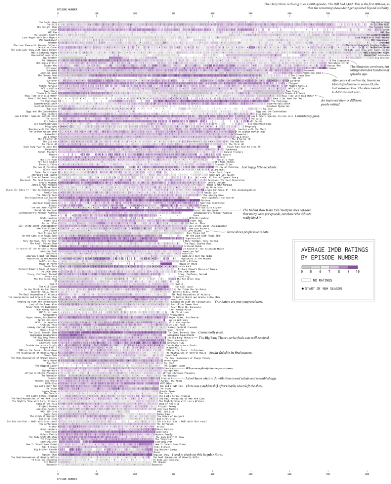
The longest TV shows
Are there television programs that seem to go on forever? We could say yes, especially if our reference is The Daily Show, which has more than 4,000 episodes and is still on the air.
In the following image, you will find the 175 longest-running series recorded in the Internet Movie Database (IMDb) and visualized by Nathan Yau, Ph.D. in Statistics. He follows the model of a heat map by Jim Vallandingham with IMDb’s episodes and seasons rating based on a chart published on Reedit in 2018.
They show that it is possible to use data science to explain pop culture. In addition, there are creative ways to bring the quantitative and qualitative together, making it easier to understand a large amount of information.
Read the entire article and explore the visualization here.
The climate disaster is here
Heatwaves, floods, fires, and soil erosion: climate disaster is here. On the COP 26 summit in Glasgow from November 1 to 12, Oliver Milman, Andrew Witherspoon, Rita Liu, and Alvin Chang made a special report on these climatic phenomena resulting from the unprecedented temperature rise.
If the figures are worrying, the graphics make it tangible that we are experiencing climate change. Using raster data, which are cells whose color indicates variations in intensity, they show how heat waves and other phenomena are increasing between now and 2080 and as temperatures rise if current policies are maintained.
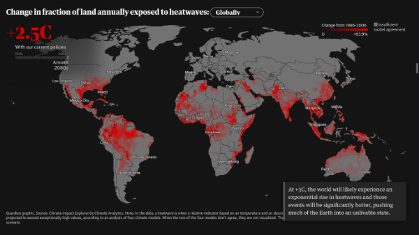
Source: The climate disaster is here - this is what the future looks like.
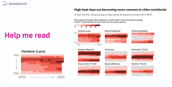
How can we interpret the data from the visualizations? Sometimes the complexity of these types of graphics limits them from reaching more people. Alli Torban makes several recommendations on visualizations and highlighted the note “In many cities, it’s getting too hot to work” from The New Stateman. Patrick Scott accompanied his graphs with visual aids such as arrows or small multiples to aid their readability. We could do this from data journalism to reach the audience and instruct and generate interest in the visualizations.
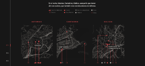
The Castles of Spain
With the past, we understand the present. Moreover, ignorance prevents us from valuing and protecting historical and cultural heritage, essential for any society. In Spain, for example, there is a large number of castles, forts, palaces, forts, and towers dating from prehistoric times to the contemporary era. The problem is that there is neither an inventory nor sufficient funds for their conservation.
The newspaper El Confidencial created an interactive map of these buildings. They used Google Maps to locate each of them. More than 10,000 geospatial data were reviewed and cleaned manually. As a result, some locations are approximate, and others refer to elements that have almost disappeared.
Read the complete report and track the buildings in this link.
#EVENT
Conference on visualization and visual analytics
VIS 2021 is an annual conference organized by IEEE since 1996. It addresses topics on theory, methods, and scientific applications of visualization and visual analytics. According to the Google Scholar h-index in 2016, it is the most valued venue for visualization research and the second most valued conference for computer graphics in general.
This year’s edition will be virtual and will take place October 24-29. Discover the agenda and register at VIS21 or follow everything that happens on its Twitter account.

#CHALLENGE
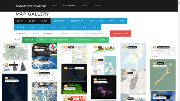
30 Day Map Challenge 2021
Topi Tjukanov is a Finnish geographer recognized for creating the #30DayMapChallenge on social media every November every year since 2019.
In this challenge, each day of the month has an assigned category of visualization types or themes: from maps in shapes and colors, choropleth and heat maps, to population, land, water, boundaries, etc., and each user decides how to carry them out.
Maps are essential visualizations in data journalism. In addition, their different typologies offer new and exciting opportunities for storytelling and reporting.
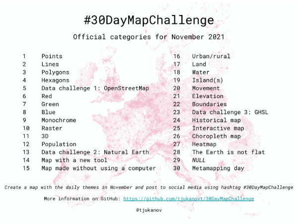
In 2021, there are three new challenges to be developed using OpenStreetMap, Natural Earth, and the Global Human Settlement Layer. You can find out more information in the official challenge repository on GitHub.
If you want some inspiration, we invite you to check out our” 5 recommended tools for creating interactive maps” and to review the results of this 2020 challenge by David Friggens in his 30 Day Map Challenge Gallery.
#NEWS
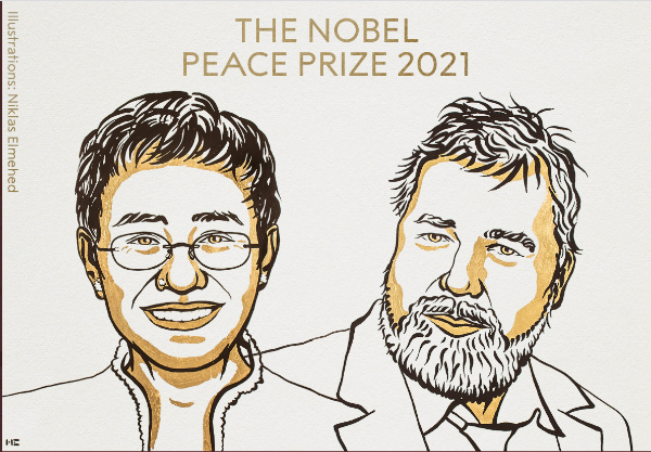
Nobel Peace Prize 2021 to two journalists
Maria Ressa, a Filipino journalist and fact-checker, and Dmitry Andreyevich Muratov, a Russian reporter, received the Nobel Peace Prize for safeguarding freedom of expression, a precondition for democracy and lasting peace.
Ressa has been a key leader in the fight against disinformation. But, unfortunately, this has made her the target of attacks for critical coverage of her media organization, Rappler, to Philippine President Rodrigo Duterte.
Muratov is editor of Novaya Gazeta, the media outlet most critical of the Kremlin, according to the Committee to Protect Journalists (CPJ). He dedicated the award to six staff members of his newspaper who were killed for exposing human rights violations and corruption.
They are the first journalists in 86 years to win a Nobel Peace Prize since Germany’s Carl von Ossietzky won it in 1935 for revealing his country’s secret postwar rearmament program. Their work and recognition are a sign of the need to continue our collective efforts to improve our societies.
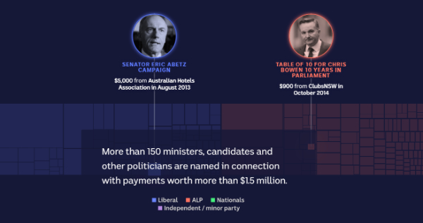
Money, gambling, and power
ABC News revealed in this investigation, which warns about a new attack on democracy, how people or organizations with interests in the gambling industry have donated money to political parties in Australia.
Several ministers are among the primary beneficiaries. One of them is Tony Abbott, former Prime Minister of Australia, mentioned more than a dozen times. The “contributions” he received range from a lunch with the company ClubsNSW worth $110 to a dinner with the Australian Hotel Association valued at $105,000.
ABC News tracked gambling-related political payments between 1998-1999 and 2019-2020. They estimate about $81.77 million in contributions, although the figure may be higher.
Photographs, treemaps, bar charts, and a circle pack tree accompany the main text of the investigation.
#COURSE
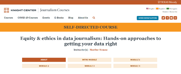
For better journalism
The Knight Center seeks to strengthen the implementation of equity and ethics in storytelling with data. It was conducted in 2020 and led by Heather Krause, a data scientist, and journalist, and has been published openly and free of charge so that anyone can take it freely.
It has five modules, with lectures, readings, videos, and exercises to strengthen your research, collecting, analyzing, and communicating skills.
#ARTICLE
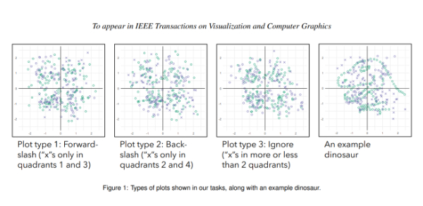
Jurassic Mark: Inattentional Blindness for a Datasaurus Reveals that Visualizations are Explored, not Seen
Graphs communicate data effectively because they take advantage of the visual system’s ability to extract patterns quickly. However, this extraction sometimes does not occur at a glance. Instead, it requires active exploration through a series of filtering operations.
This is explained by Tal Boger, a student of Statistics and Data Science at Yale University; Steven B. Most, associate professor of Psychology at the University of New South Wales, Australia; and Steven L. Franconeri, professor in the Department of Psychology at Northwestern University. A fun experiment using the figure of a dinosaur revealed how blindness and inattention are generated when interacting with data visualization.
His writing, which you can read in full at this link, is instrumental in knowing the right ways to present information and improve the viewer’s approach.
#RESOURCES
Finally, here are two resources that may be useful in your next research.
- The Practical Guide of Recommendations: Feminism, Ethics, and Geospatial Data, by La Iniciativa Latinoamericana por los Datos Abierto (ILDA). Its authors, Selena Yang and Sofia Donner seek to promote discussion on feminism and geospatial data during joint meetings and activities. The guide is in Spanish.
- Our blog post Data visualization: Alluvial Diagram, in which we explain what this type of visualization consists of, when to use it, give examples of how it has been used, recommendations, and compare it with other types of visualization.
That's all for now!
We invite you to stay tuned to our newsletter. Together we strengthen data journalism!
If someone sent you this email and you want to keep updated with the best of data journalism, we invite you to subscribe.
Remember that in Datasketch, we have other newsletters, with which you will also learn about Data Culture* and Open Government.
*In our last issue of the Data Culture newsletter we made a mistake and published an announcement about a prize that has not been launched. We have corrected the error and you can now read the revised version of it at Arts and data: transforming perspectives -Data Culture #5