


Universe, Farewells and Natural Phenomena - Data Journalism #08
We farewell the year trying to discover how the Universe works. December 2021.
Available in:
We are Nicolás Barahona, Juan Garnica, Laura Tamia Ortiz and Juan Pablo Marín, Datasketch’s Data Journalism team.
Have you reached us through social networks, or have you been forwarded this newsletter and want to receive it in your inbox? Subscribe! The previous issues are here.
#DATAVIZ
The best visualizations
Since 2010, data visualization expert Andy Kirk (visualizing data) has been rounding up the most exciting and provocative resources each month.
Among his selection, you will find data visualizations and infographics, articles, educational resources, news, and various topics that will inspire you and help you understand the world of data visualization from high-quality examples.
In December, he has published his selection for July, August, and September. Kirk clarifies that the timing of his reviews sometimes varies due to his availability. Therefore, he did not necessarily publish the selected news items that month, but he considered them when he discovered them.
#UNDERSTANDING-THE-UNIVERSE
Population by latitude
Have you ever wondered how many people there are in the world and their distribution? With this series of visualizations created by Alasdair Rae, founder of Automatic Knowledge Ltd, using 2020 data from WorldPop, you will be able to answer this question.
The originality of these visualizations is that they are made considering the latitude of the planet, which allows obtaining visualizations as curious as to the one that accompanies this text - although it offers several alternatives that will enable a better understanding of the data.
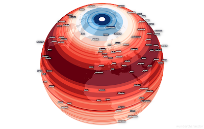
Source: Stats Maps NPIX - World Population by Latitude
"Looking deep into space is also looking back in time."
The James Webb Space Telescope lifts off on December 24, and thanks to it, we will be able to learn how light was born in the universe. Nuño Domínguez, Mariano Zafra, Jacob Vicente López and José A. Álvarez created a special/spacial report (es) on this topic for El País. In it, they talk about the creator, scope, and projects that the telescope will have.
The James Webb will see the first stars and galaxies from 13.7 billion years ago, 100 million years after the Big Bang. In other words, it will be able to see the first light of the universe or “cosmic dawn,” as they name it in the astronomy field.
The text would not be enough to dimension what is related to space. Therefore, this report uses renderings, infographics, and galaxy comparisons between visible light (Hubble’s capability) and infrared (Webb’s capability) to discuss the telescope’s reach.
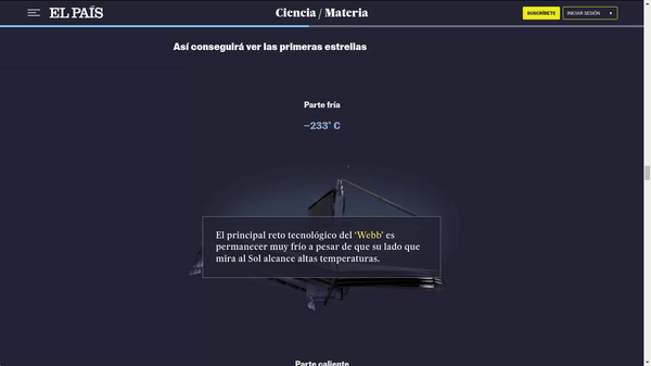
Source: James Webb: El telescopio que verá cómo nació la luz en el universo | Ciencia | EL PAÍS
Serengeti in Motion
National Geographic offers this special, in which you can see how the landscape affects and drives the migration of the last remaining large mammals on earth. Changes in rainfall, soil quality, and food availability cause more than a million wildebeest and their young to travel up to 1,750 miles in search of food and water.
Thanks to this map, you can discover the region’s peculiarities and the dangers the migrating species face over a year. In addition, thanks to the Serengeti Tracker, you can follow almost live the movements of several specimens of wildebeest, zebra, and antelopes.
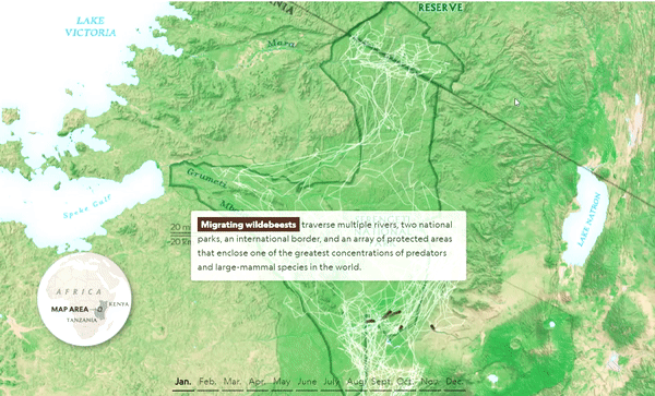
Source: Tracking the great Serengeti wildebeest migration
Poison in my water
Datacrítica and Quinto Elemento Lab analyze in this special issue the impacts on the quality of water consumed by Mexicans based on the analysis of data provided by the National Water Commission (Conagua) and personal experiences of affected territories, such as that of activist Claudia González.
They highlight a growing problem in the country: uncontrolled water extraction contaminates this essential resource with arsenic and fluoride - the water with arsenic drunk in Mexico exceeds 70 times the limit allowed by the WHO. They explain the health consequences of this and the lack of response from the competent authorities.

Illustration by Omar Bobadilla via: Datacrítica
#PandemicConsequences
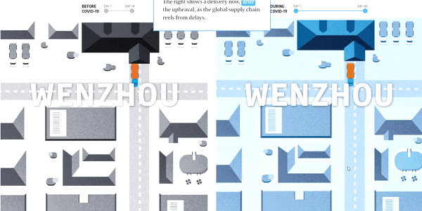
The Supply Chain is Broken
We are experiencing a break in the global supply chain, leading to a worldwide shortage crisis. The causes are multiple but closely related to the COVID crisis, and the consequences could affect our daily lives and the way we consume.
Joyce Lim, Alyssa Mungcal, and Christopher Udemans, Straits Times reporters, tracked an order of bicycles from China to Singapore before and after the breakdown of global supply chains. That resulted in a 26-day difference in product delivery.
The report exposes the impact on time (and resources) with a mirror image showing the route taken by the transport company from the point of origin until the product arrives at its destination and multiple graphics.
It is not the only media outlet to cover this topic. This article in The Wall Street Journal, written by Stephanie Stamm, Ruth Simon, Austen Hufford, and Inti Pacheco, shows how a delay in product delivery can impact a small business.
They tell the story of “A Kinka”, a small-sized container ship stuck in a shipping logjam for 54 days. Prolonged delays in delivering goods from this ship created financial pressures on several small businesses, such as Youth Rise Up or John N. Hansen Co.
They paid in advance for merchandise, duties, and shipping costs and have not collected revenues until delivery of the goods to their customers, i.e., months late. They assumed costs greater than the final profit and could not pay their workers. Those small businesses have needed to seek lines of credit.
Tourism after the crisis? It seems not
The World Tourism Organization forecasts that the flow of international travelers in 2021 will be 70 to 75% lower than in 2019. In addition to the impacts generated last year by the coronavirus, the emergence of two critical variants (Delta and Omicron) prevented sustaining the industry’s revival.
The Economist provides a timely and data-driven analysis of this situation. Firstly, it is handy to understand how the pandemic affects our economies (impacting our quality of life). Second, it sizes up the sector’s fragility in the face of political disputes from powers such as the United States and China and the degradation of our environmental security.
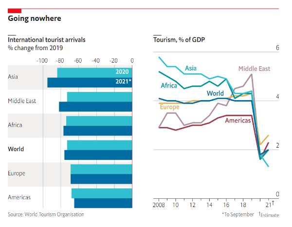
Source: This year may prove even worse for the tourism industry than 2020 | The Economist
If you want to find inspiration in generating climate change-related content, we invite you to read these weekly compilations of visualizations made by Hassel Fallas and his team at La Data Cuenta.
Food suffers
Axios does this analysis on how the U.S. food industry has evolved and how COVID has accelerated that transformation:
- 🌽 As we’ve already talked about supply chain disruption, corn was one of the hardest-hit commodities.
- 👩🍳 The food and hospitality sectors continue to recover, albeit at a slow pace. Workers no longer accept the sector’s conditions and prefer to work in other areas.
- 🚴♂️ Demand for delivery drivers has been very high and fast. According to this report, regulations protecting workers have not kept pace, making those jobs much more dangerous.
- 🐄 Climate change increases the pressure to modify how we grow and consume food. Climate scientists say that the food chain generates a large share of greenhouse gas emissions annually, mainly from animal products.
- 🤖 Automation is entering various food industry aspects and could replace some workers.
- 🍟 According to the Uber Eats cravings report, french fries and pad thai were the most requested meals in the US.
#TORNADO
The wave of tornadoes in early December was one of the deadliest in U.S. history. More than 1,000 tornadoes are recorded in the country every year, in addition to episodes of strong winds and hail.
Major international media closely follow the impacts of the 69 tornadoes that have swept 400 kilometers in a straight line and have caused the death of more than a hundred people.
El País explained how tornadoes are and how they are produced, providing scientific details with data that the National Meteorological Service has compiled on this tragedy.
The New York Times made a detailed exploration and identification of the damage. This multimedia report’s elements are a time-lapse with satellite images of before and after the passage of the tornadoes and the points with power outages.
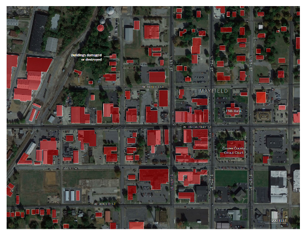
Source: Maps: Where the Tornadoes Struck, Destroying Buildings and Homes - The New York Times
#EDUCATION
Being a data journalist is demanding. But, unfortunately, not all media outlets understand its importance and the value of having professionals who know how to map, explore, cleanse, structure, visualize and narrate the essence of data sets.
DataJournalism.com (an initiative supported by Google and the European Journalism Center) offers free online resources, materials, videos, and community forums for the various profiles of media and related companies.
In this link, you will find 13 courses, including data cleaning in Excel, fact-checking, storytelling and programming. They are offered free of charge by experts, include video explanations, and have an average duration of 48 minutes.
At Datasketch, we believe that making sense of immense amounts of information and opening a way to facilitate its use are two services that every organization should offer. Therefore, we have developed a list of applications to visualize in 3 steps. Also, as is this newsletter, we create content for our community to learn more about the power of data.

#TRIBUTE
Darren Long, creative director of The South China Morning Post, passed away last November 26th after a battle with cancer. During his seven years at the medium, he consolidated one of the world’s most outstanding data-driven visualization and storytelling teams, achieving 488 awards across four continents.
His legacy extends to transforming magazines and news organizations in the UK and Asia, demonstrating how to link art and communication with the highest standards of professionalism. His team made this beautiful tribute, inviting us to explore the work of one of the masters of illustration and graphics.

Fuente: In memory of Darren Long, 1967-2021
Christmas bonus
After reading our newsletter, if you’re still without topics to discuss at the upcoming family gathering conversations that probably await you, you’re in luck. Data and visualizations lend themselves to all sorts of issues and can help you talk about Christmas itself with propriety.
Ipsos MORI researched the British population and answered questions most of us have asked ourselves this holiday. For example, what gifts are acceptable (or not) at this time of year, the appropriate time to set up decorations, or whether it’s okay to wear Christmas sweaters.
You may not agree with some answers, but it can help you settle arguments with a fact-based discussion.
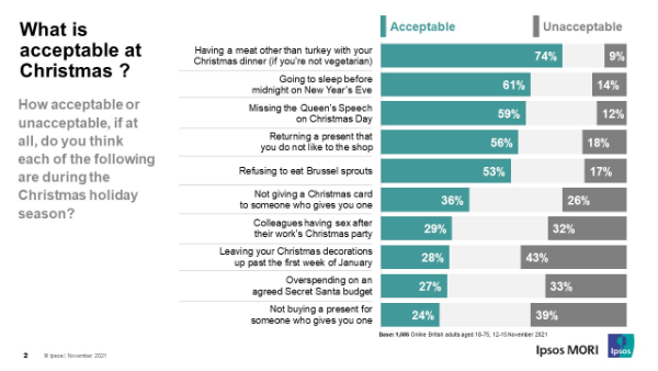
Source: What do the public consider acceptable and unacceptable at Christmas? | Ipsos MORI
Another hot topic at this time of year is snow and its visualizations. Although the evidence is less hopeful in this case, a “white Christmas” is becoming less and less likely in many places.
The U.S. National Office of Oceanic and Atmospheric Administration updated data on the average “normal” temperature over the three-decade period. The decrease in snowfall due to the climate crisis is evident. According to the map made by Dominic Royé in R, the same is true for Europe, based on data from ERA5-Land.
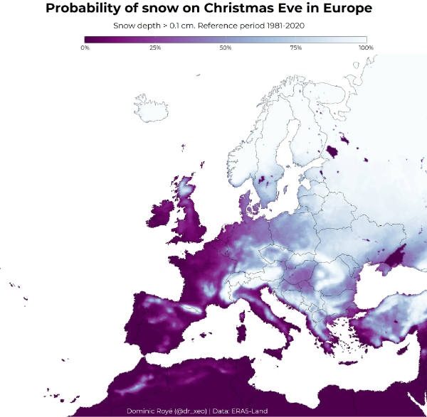
Source: @dr_xeo/status
That's all for now!
If someone sent you this email, and you want to receive it in your inbox, please, subscribe!
We have other newsletters, which might interest you: