


Challenges and UX Accesibility - Data Journalism #11
We will review the latest creative challenges from the data community and select some news and recommendations. March 2022.
Available in:
🥳 In this edition, we tell you about the Sigma Awards and the upcoming trade show at Casa Datasketch. We will review the latest creative challenges from the data community and select some news and recommendations that we like and that you can use in your following projects.
If someone has forwarded you this newsletter, and you like it, you can subscribe here.
Casa Datasketch
We have two pieces of news that make us happy, and we want to share them with you.
The project We Know What You Did Last Legislative Period, in which we participated, was among the 100 selected in the first phase of Sigma Awards 2022 🎉. It is a competition that recognizes the world’s best projects in data journalism.
We are happy for two reasons. First, we have such powerful allies as Cuestión Pública, which carried out the research. Second, Datasketch developed the web, visualizations, and apps for this project. The nomination has been possible thanks to the efforts of both teams. Building collectively makes us stronger. 🤝🏽💪🏽
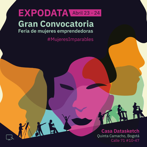
On the other hand, in April, the Casa Datasketch is going to have movement. We are organizing the ExpoData: Women, Innovation, and Creation fair. We want to support and make visible women entrepreneurs and generate networks for economic reactivation using data in Colombia.
Registration opens very soon. If you are in Colombia, we recommend paying attention to our social networks in the coming days. There we will provide all the information about the conditions of participation, and we will publish a form from which we will select the exhibitors.
DataViz
This edition is about challenges, and there is nothing we like more than the whole data community working collaboratively. So we present you one that is starting and another one that has just finished.
#30DaysChartChallenge
April is just over a week away, and with this month comes the 2022 edition of the #30DaysChartChallenge! Thirty days, Thirty charts, five categories, and a free way to create. Are you up for it?
It is a unique opportunity to take ideas, inspiration, and meet great data visualization artists, including Cédric Scherer and Dominic Royé, the organizers of this challenge.
We will highlight the visualizations that impress us the most as the month progresses. Follow our social media and if you participate, feel free to tag us (@datasketch).
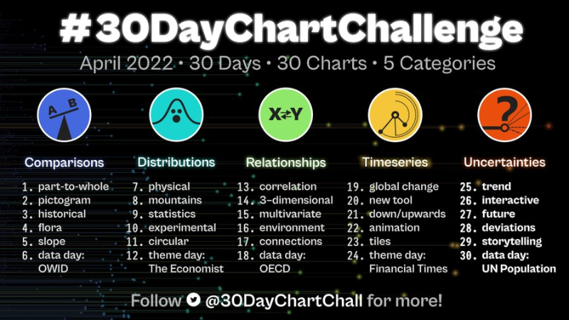
Source: #30DaysChartChallenge
#DuBoisChallenge2022
On the #BlackHistoryMonth commemoration in February, the data community participated in the #DuBoisChallenge2022. It is the second version of the challenge, which recreates the iconic visualizations of the American sociologist W.E.B. Du Bois with current tools such as R, Tableau, PowerBI, etc.
Learn more about this classic visualization with Tableau’s talk “Data+Diversity: The Life and Visualizations of W.E.B. Du Bois.”
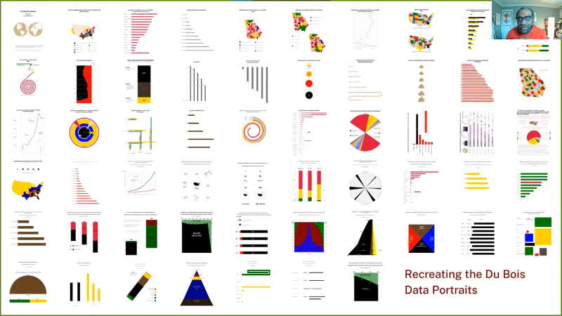
Source: Data+Diversity: The Life and Visualizations of W.E.B. Du Bois
TAKE A BREAK
People have received intense news about wars, economic, and climate crises last few weeks. Journalists, researchers, and data analysts are doing enormous work to get the information to us. However, as happens in these cases, the over-information is also overwhelming. That is why we highlight here a more casual visualization: Bubble Tea: A Breakdown. 🥤
One way to get to know a country is with its food and drinks. In Taiwan, they are proud of their bubble tea. Its beauty lies in its limitless possibilities: you can completely customize your drink to your liking. Thanks to this visualization, published in Taiwan Data Stories, you can discover its many alternatives.
The authors, Julia Janicki and Daisy Chung, analyzed the drink menus of the 5 most popular establishments as of February 2021 according to Google Trends data and the YouTuber Data66.
They offer you a tour to create your virtual drink, which you can download at the end. We invite you to go to your favorite store and make the whim we’ve just created.

Source: Bubble Tea: A Breakdown | Taiwan Data Stories
DATATIP
An effective data visualization must be accessible. Thus, it achieves its task of displaying data by reaching as many people as possible. Consider then the colorblind audience.
Lisa Muth of Datawrapper made recommendations about color and brightness and supporting labels, symbols, shapes, patterns, and interactivity that complement color. For example, she points out that if you want your graphics to be legible to someone with color blindness, you can not combine green with orange/red or a blue of the same brightness.
By following the guidelines in this article, you will make the viewing experience even easier for anyone.

Source: What to consider when visualizing data for colorblind readers
Want to read more?
We offer you a varied selection of other content that we like.
Green
- ☀️ How many days since a record-high temperature? | Pudding
- 🌄 The Diverse Topography of Switzerland | Tobias Stalder
- 🌀 SVS: GISTEMP Climate Spiral | NASA
Gender
- 💸 Which Countries Feature Women on Banknotes? | Visual Capitalist
Dataviz
- 🐻 South Korean Election Graphics are Next Level | Andrew Peng
Fact Check
- 📉 How you frame and present statistics is as important as the statistics themselves | Paul Bernal
- 🔍 The Fifth Wave: Who Fact-Checks the Fact-Checkers? | Discourse
A pinch of humor
A flowchart titled “Become a data scientist in 50 days” circulated on Twitter in the last few days. Data engineer Paul Crickard posted it with this text: “Damn. Data science only takes 50 days. Python takes 5 only…”.
It received multiple replies within the data community, including one from Sociology Professor Kieran Healy. He replicated the diagram by being a bit more realistic, which we can relate to. He increased the number of days to 350 in 19 steps, including therapy days in the learning process.
See you next time!
Juan Garnica, Laura T. Ortiz, and JP Marín Díaz wrote this newsletter. If someone has forwarded you, and you like it, you can subscribe here. Check out our blog and newsletters.
Twitter | Facebook | Instagram | LinkedIn | Blog | Newsletters