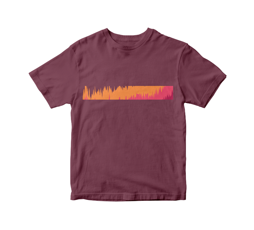
Changes in Global Temperature
We made a visual representation of global temperature changes since 1919. This one illustrates the increase in average temperature, according to Berkeley Earth data.
Available in:

This data visualization is inspired by the work of climatologist Ed Hawkins, an international reference for using data visualization to warn about climate change.
Hawkins created a graph called #ShowYourStripes that shows changes in global average temperature at the Earth’s surface and in different regions of the world. It is a reference data collected since 1850 by different institutions such as the UK Met Office and the Berkeley Earth.
His work is striking, firstly, because it communicates in a simple way how our planet is warming drastically; secondly, because, due to this negative evolution, his visualizations will soon have to incorporate new colors and tones, previously not contemplated, that represent the increase in global temperature.
We take the data he uses in his visualization and present a new proposal created using the Datasketch Apps.

You can access the data and create your own proposals here.
You can purchase the products associated with this design at https://co.datasketch.store/


